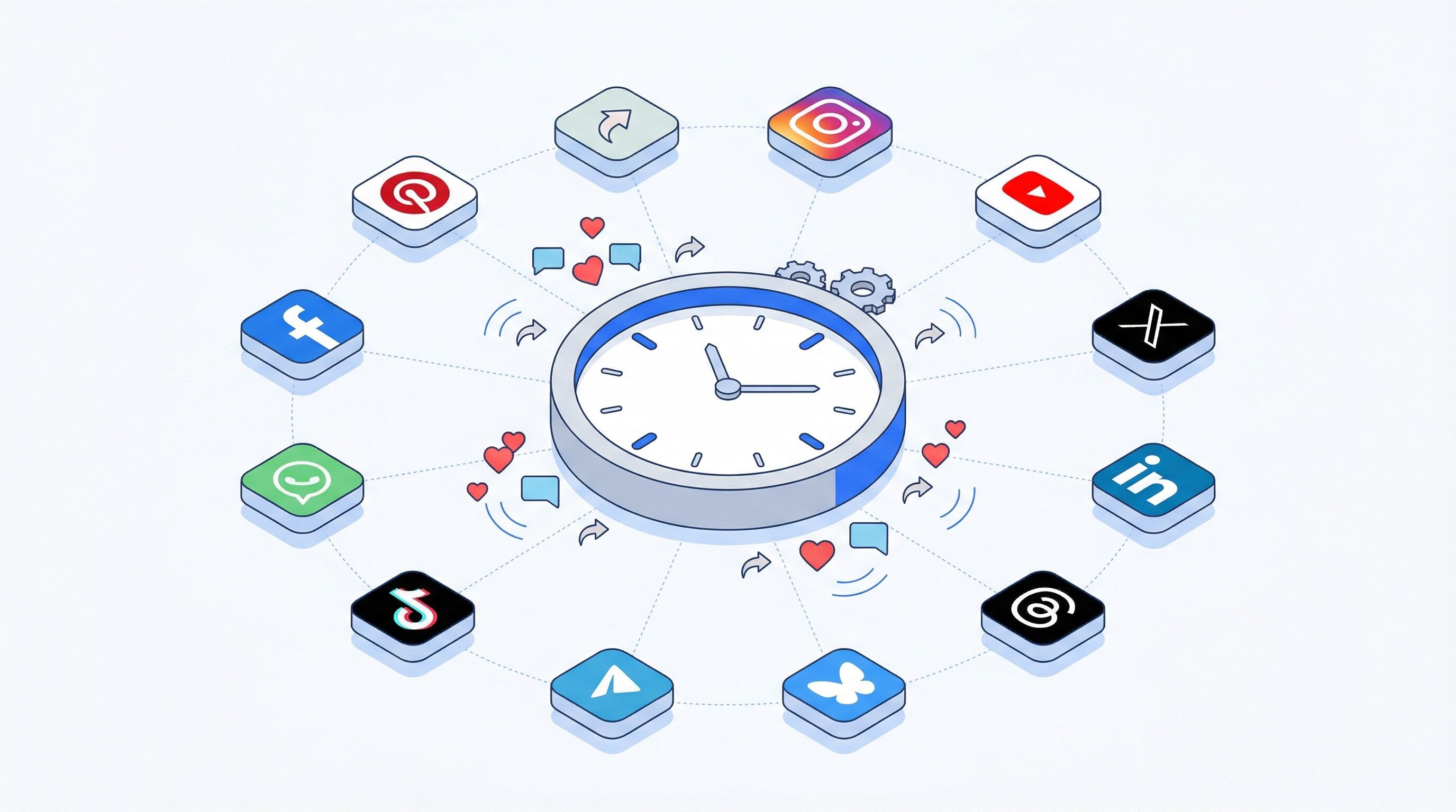
The Ultimate Guide to LinkedIn Post Sizes for Maximum Impact
Master LinkedIn post sizes with our complete guide. Get the correct dimensions for images, videos, carousels, and ads to boost your professional brand.
On this page (8)
For your images to look sharp on LinkedIn, stick to 1200 x 627 pixels (a 1.91:1 ratio) for any shared links and 1200 x 1200 pixels (a 1:1 ratio) for square images you upload directly. These sizes stop the platform from awkwardly cropping your visuals on desktop and mobile.
Why Getting LinkedIn Post Sizes Right Is a Big Deal
Nailing your LinkedIn post sizes is not just a fussy technical detail; it's a smart move that has a real impact on your professional image. The feed is a busy place, and a perfectly sized visual is your best shot at getting someone to stop scrolling.
If an image is the wrong size, it can end up looking blurry, pixelated, or even worse, have the most important part chopped off. That kind of mistake instantly makes your content feel unprofessional and can hurt your credibility before anyone even reads your post.
Boost Your Visibility and Look More Polished
The LinkedIn algorithm gives a little boost to content that creates a good experience for users, and properly sized images are a key part of that. When you use the recommended dimensions, you’re giving the platform a reason to show your post to more people.
It’s all about sending the right signals. A crisp, clean visual makes people more likely to react, comment, and share. It’s a simple way to show you care about quality.
- Make a Stronger First Impression: The right dimensions present your brand with the professional polish it deserves.
- Get Higher Engagement: We consistently see that posts with optimized images get more likes, comments, and shares.
- Communicate Clearly: Your message stays intact, with no risk of logos or key text getting cut off.
This is especially true as LinkedIn's user base grows. In a market like Bulgaria, for instance, the platform hit 1.30 million users in early 2024, which is an 18.2% jump from the previous year. To connect with an expanding professional audience like that, you need to know what works. Understanding the right formats, whether it's a 3:4 video or a 1200x627 banner, helps you stand out. You can dig deeper into stats like these over at DataReportal.
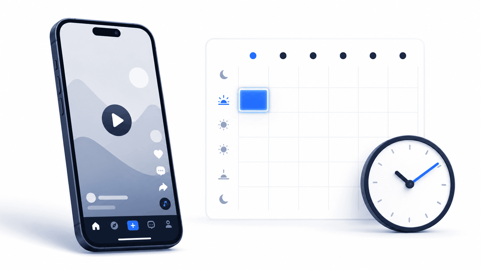
The easiest way to stay on top of this is to use a scheduler that handles the optimization for you. The PostFast LinkedIn integration is built to do just that, making sure every post you share looks its best without any extra work on your end.
LinkedIn Image Dimensions: A Quick Reference Cheat Sheet
For those moments when you just need the numbers, fast, I’ve put all the essential LinkedIn post sizes into one scannable table. It covers everything from your profile picture to company page assets.
Think of this as your go-to lookup guide. It cuts out the guesswork by giving you the exact pixel dimensions, aspect ratios, and file size limits you need. Bookmark this page, and you’ll spend less time fiddling with sizes and more time creating content that looks sharp and professional.
All LinkedIn Sizes In One Place
Remember, getting the dimensions right is the first step to looking polished. The right size prevents awkward cropping and ensures your brand visuals are presented exactly as you intended. While a tool like PostFast can automate this with built-in templates, having a quick reference on hand is always a good idea for planning.
The goal is simple: make your content look intentional and professional, every single time. Correct sizing is the first and most important step.
Here’s a complete breakdown of the most common visual assets for both your personal profile and company page. Keep these numbers handy.
LinkedIn Image and Video Dimensions Quick Reference
This table summarizes the most critical LinkedIn image and video dimensions. Use it for quick lookups on recommended sizes, aspect ratios, and maximum file sizes to ensure your visuals always look their best.
| Asset Type | Recommended Dimensions (Pixels) | Aspect Ratio | Max File Size |
|---|---|---|---|
| Profile Photo | 400 x 400 | 1:1 | 8 MB |
| Personal Banner | 1584 x 396 | 4:1 | 8 MB |
| Company Logo | 400 x 400 | 1:1 | 4 MB |
| Company Cover | 1128 x 191 | 5.9:1 | 4 MB |
| Feed Image (Square) | 1200 x 1200 | 1:1 | 5 MB |
| Feed Image (Link) | 1200 x 627 | 1.91:1 | 5 MB |
| Carousel Card | 1080 x 1080 | 1:1 | 10 MB |
| Video (Square) | 1080 x 1080 | 1:1 | 5 GB |
| Video (Vertical) | 1080 x 1350 | 4:5 | 5 GB |
Having these specs nearby will save you a ton of time and prevent the frustration of re-uploading assets that don't fit. Keep this guide handy for all your LinkedIn content creation.
Getting Your Profile and Company Page Images Right
Think of your LinkedIn profile and company page as your digital storefront. Getting the images spot-on is like giving a firm, confident handshake, it sets the tone for every interaction that follows and makes a lasting first impression.
These are not just decorative visuals; they're strategic assets. A crisp, professional photo and a well-designed banner instantly communicate your brand’s identity, building credibility before anyone even reads a word of your content.
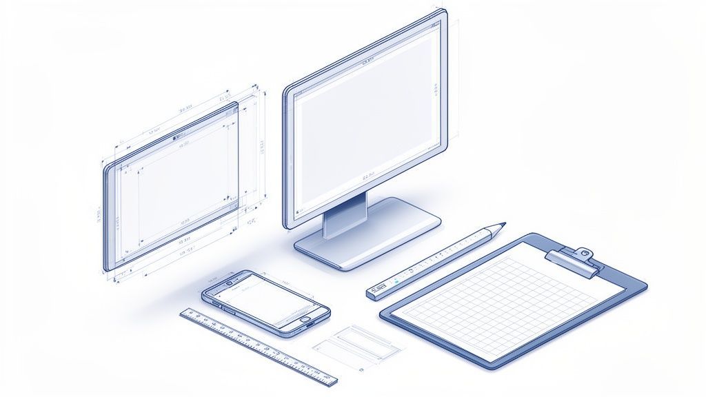
This section breaks down the exact dimensions you need for these foundational images. We'll cover your personal profile photo and background, plus the essential assets for your company page. It's about more than just numbers; it's about crafting a polished, coherent brand presence.
Perfecting Your Personal Profile Visuals
Your personal profile is where your professional story starts. The two most important visual elements are your profile photo and your background cover image, and each has its own rules for making a great impact.
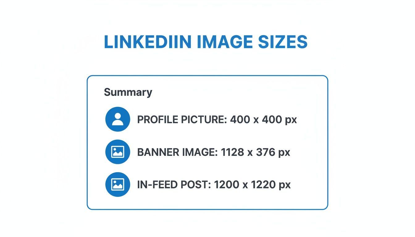
- Profile Photo Dimensions: The sweet spot is 400 x 400 pixels. LinkedIn will crop this into a circle, so make sure your face is centered. Don't put anything important in the corners, or it will get chopped off.
- Background Cover Image: You'll need an image that's 1584 x 396 pixels. This wide, panoramic space is perfect for showing off your personality, your area of expertise, or your company's branding.
This quick visual guide sums up the key sizes for your profile, banner, and feed posts.
As you can see, profile photos are square, but banners are distinctly rectangular. You'll need a different design approach for each.
Here's a critical tip for your background image: think "safe zone." LinkedIn crops this image differently depending on whether someone is viewing it on a mobile, tablet, or desktop. Keep any vital info, like text or logos, away from the edges and closer to the center. That way, you can be sure it's always visible, no matter the device.
Nailing Your Company Page Branding
For any business, the company page is the official brand hub. Professionalism and consistency are everything, and that starts with the logo and cover image. The dimensions here are a bit different from personal profiles.
The main banner for a Company Page should be 1128 x 191 pixels. It's a much thinner, more rectangular space than the personal banner, so your designs will need to be adapted. Keep it clean, avoid clutter, and use this space to reinforce your brand message or highlight a current campaign.
Remember, your Company Page cover is often the first visual touchpoint for potential clients, partners, and employees. A crisp, well-composed banner builds immediate trust and authority.
Getting these static images right ensures your page looks complete and professional from the get-go. If you're managing multiple clients or brands, using a scheduler like PostFast with built-in templates can be a huge timesaver. It helps ensure every page you manage meets these exact specifications without you having to look them up constantly. That kind of consistency reinforces a detail-oriented, professional approach to your work.
Designing High-Impact Feed Images and Carousels
The LinkedIn feed is a crowded space. You're competing with everything from major industry reports to job announcements, so your visuals need to stop the scroll. This is where getting your feed images and carousels right makes all the difference in grabbing attention.
Knowing the different LinkedIn post sizes gives you the right canvas for your message. Each orientation has a specific job to do, and you can use them strategically to tell your story more effectively. The most common formats you'll be working with are square, vertical, and horizontal.
Choosing the Right Image Orientation
Picking between square, vertical, or horizontal isn't just a design choice, it's a strategic move that affects how people interact with your post.
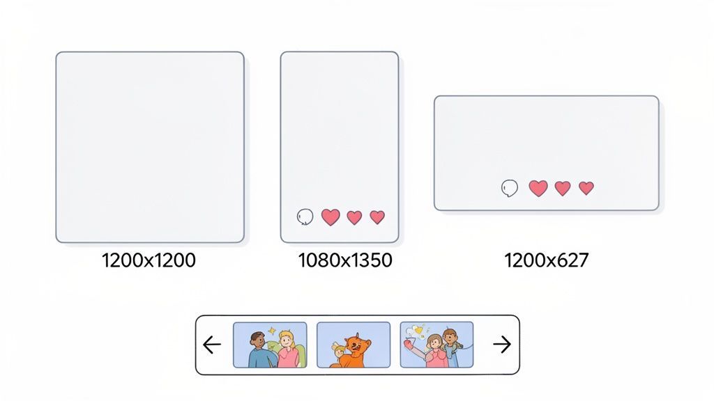
- Square Images (1200 x 1200 pixels): This is your safest and most versatile bet. A 1:1 aspect ratio displays cleanly on both desktop and mobile feeds, so you never have to worry about awkward cropping. It’s perfect for single-image announcements, quotes, or simple infographics.
- Vertical Images (1080 x 1350 pixels): With a 4:5 aspect ratio, vertical images claim more screen real estate on mobile devices. This makes them incredibly effective for capturing attention and a great choice for detailed infographics or portraits where you want to maximize visual impact.
- Horizontal Images (1200 x 627 pixels): Best known as the standard size for link previews, the 1.91:1 ratio works well for traditional landscape photos or wide graphics. Just be aware that it occupies the least vertical space in the mobile feed.
With LinkedIn's user base in Bulgaria hitting 1.30 million in 2024, getting your post sizes right is more important than ever. Optimally sized content, like a crisp 1200 x 1200 square image, is essential to capture this growing audience.
Crafting Compelling Carousel Posts
Carousels, or multi-slide documents, are one of the most powerful content formats on LinkedIn right now. They let you tell a story, break down a complex topic, or show off a portfolio, keeping your audience engaged and swiping for more.
For the best results, make each slide in your carousel either 1080 x 1080 pixels (1:1 ratio) or 1080 x 1350 pixels (4:5 ratio). Keeping the size consistent across all slides is the key to a smooth viewing experience. Using a tool like PostFast helps you assemble these slides and ensures they publish perfectly every time. For a deeper dive, check out our guide on creating LinkedIn carousels: https://postfa.st/api-guides/linkedin/carousels.
Think of your carousel as a story. The first slide is your hook, the middle slides deliver the substance, and the final slide is your call to action.
Controlling Your Link Preview Thumbnails
When you share a link, LinkedIn automatically grabs a thumbnail image from the webpage, and it's often not the one you want. To keep your feed looking professional, you should always customize this image.
The recommended size for a link preview image is 1200 x 627 pixels. You can usually upload a custom image directly on LinkedIn after you paste the link. After you've designed your visuals, the next step is uploading images to social media correctly to meet LinkedIn's exact specs. For total control, make sure the source webpage has the correct "og:image" tag set, a process that becomes much simpler when you use a content scheduler that shows you a live preview.
A Complete Guide to LinkedIn Video Specifications
Video is easily one of the most powerful formats on LinkedIn, but getting it right is more than just hitting record. The technical details matter. A lot. Unlike a static image, a video has a bunch of moving parts, aspect ratio, file size, format, and each one can make or break how your audience sees your content.
Get these specs wrong, and you risk frustrating upload errors or, even worse, a clunky viewing experience that makes people scroll right past. Let's dig into the exact technicals you need to nail.
Core Video Requirements and Dimensions
Before you even worry about the content of your video, the file itself has to pass LinkedIn's basic checks. The platform is pretty accommodating, but it has hard limits on things like duration and file size that you absolutely can't ignore.
Here are the numbers to burn into your memory:
- Video Length: Your video needs to be at least 3 seconds long but can't exceed 10 minutes.
- File Size: The absolute maximum file size you can upload is 5 GB.
- File Formats: LinkedIn accepts ASF, FLV, MPEG-1, MPEG-4, MKV, and WebM. But honestly, just stick with MP4. It's the most reliable and widely supported format.
- Resolution: The platform supports a huge range, from a tiny 256x144 pixels all the way up to a massive 4096x2304.
While LinkedIn supports a wide variety of dimensions, not all of them perform equally well, especially since most of your audience is watching on their phone. This is where your choice of aspect ratio becomes a real strategic move.
Choosing the Best Aspect Ratio for Your Video
A video's aspect ratio is just its shape, and that shape determines how much screen real estate it commands in the feed. On LinkedIn, you'll get the most bang for your buck by going with either a square or a vertical format.
- Square Video (1:1): An ideal dimension here is 1080 x 1080 pixels. Square is your safest bet. It looks great on both desktop and mobile feeds without any weird or unexpected cropping.
- Vertical Video (4:5): Sized at 1080 x 1350 pixels, this format is a real attention-grabber. It takes up significantly more vertical space on mobile screens, making it much harder for someone to just mindlessly scroll past.
- Landscape Video (16:9): This is the traditional widescreen format we're all used to. While LinkedIn supports it, it's not very effective in the mobile feed because it shows up as a small, horizontal sliver.
A strong visual hook in the first three seconds is absolutely vital. With most users viewing on mobile with the sound off, you need an immediate, compelling visual and clear captions to stop them from scrolling.
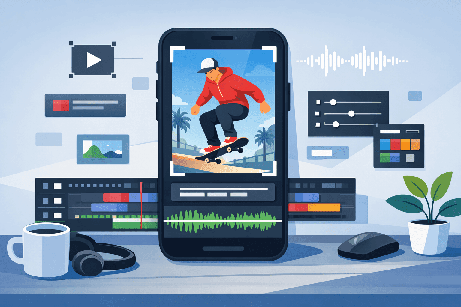
Finally, always, always include captions. A massive chunk of LinkedIn users watch videos with the sound off, particularly if they're in an office or a public space. Captions make your content accessible and guarantee your message gets across, whether the audio is on or not. With a tool like PostFast, you can easily schedule your perfectly formatted videos and add your captions and copy in one simple step, ensuring a polished final product every time.
Getting Your LinkedIn Ad Dimensions and Formats Right
When you switch from posting organic content to running paid campaigns on LinkedIn, getting the details right is no longer optional, it’s essential. Every piece of your ad, especially the visuals, has to be perfectly sized to meet the platform's strict specs. Nailing your LinkedIn post sizes for ads means your budget goes toward creative that looks sharp, professional, and is built to get results.
If your ad dimensions are off, you'll run into problems fast. An incorrectly sized image might get flat-out rejected during the ad review. Worse, it could get approved but run with awkward cropping that chops off your headline or call to action. That’s not just a waste of money; it chips away at your brand's credibility with a professional audience.
Single Image Ad Specifications
The Single Image Ad is the workhorse of LinkedIn advertising. It’s a versatile format for driving traffic and generating leads. To make sure it looks great on both desktop and mobile, you need to stick to the recommended sizes.
- Recommended Resolution: The standard is 1200 x 627 pixels. This 1.91:1 aspect ratio is optimized for how content appears in the feed.
- Square Option: You can also go with a 1200 x 1200 pixel image, which uses a 1:1 ratio and tends to perform really well on mobile.
- File Requirements: Keep your image as a JPG or PNG, and make sure it’s no larger than 5 MB.
The key here is a clean design with minimal text. Let the image grab the attention so your ad copy can do the rest.
Carousel Ad Dimensions
Carousel Ads are brilliant for telling a story, showing off a few products, or breaking down a service into its key features. For the experience to feel smooth and intuitive as someone swipes, every card in the carousel needs to be consistent.
The specs for each card are straightforward but non-negotiable:
- Resolution: Every image card must be 1080 x 1080 pixels. This maintains a perfect 1:1 square aspect ratio.
- File Size: You have a bit more room here, with a max file size of 10 MB per card.
- Card Count: You can use anywhere from two to ten cards in a single carousel ad.
The best carousel ads feel like a mini-presentation. Each slide builds on the last, guiding the user toward a clear call to action on the final card. It’s a seriously effective format for deeper engagement.
Video Ad Formats and Best Practices
Video Ads are the most dynamic way to catch your audience's eye, but they also come with the most technical rules. The aspect ratio you pick will have a big impact on how your ad performs, especially on mobile.
- Aspect Ratios: LinkedIn supports a few, but the top performers are 4:5 (vertical) and 1:1 (square). They just take up more screen real estate on mobile phones. The traditional 16:9 (landscape) format is still an option, but it’s far less effective in a vertical feed.
- File Size & Length: Your video file should be between 75 KB and 200 MB. It can run from three seconds up to 30 minutes, but let's be honest, shorter, punchier videos almost always win.
Always add captions. So many users watch videos with the sound off, and your message needs to hit home whether they're listening or not. For any campaign, you have to track what's working. To make that part easier, it helps to learn more about building UTM links for LinkedIn so you can measure your campaign's success accurately. It’s how you find out exactly which ads are driving real results.
Common LinkedIn Image Mistakes and How to Fix Them
Knowing the right dimensions is a great start, but it’s only half the battle. We’ve all seen posts that miss the mark, blurry images, pixelated text, or key details awkwardly cropped out. These little mistakes can undermine your credibility before anyone even reads what you have to say.
It usually happens when you’re moving fast. You upload a graphic that looks perfect on your computer, only to find that LinkedIn’s compression or mobile cropping has made it look sloppy in the feed. Let’s walk through the most common slip-ups and how to avoid them for good.
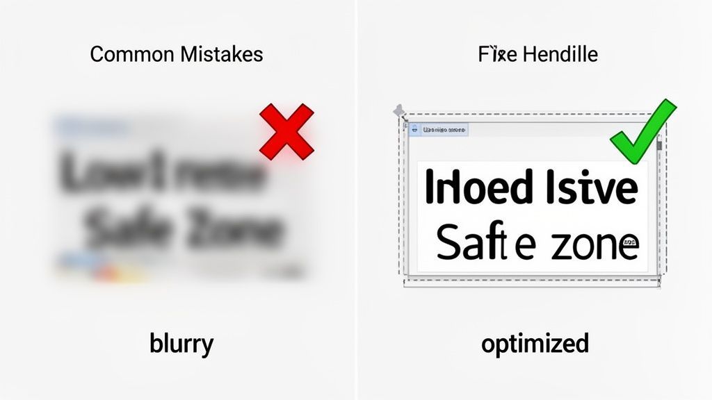
Blurry Images and Over-Compression
The most frequent offender is a blurry or pixelated image. This is almost always caused by LinkedIn's own compression algorithm working a little too hard on an already low-quality file. When you upload a fuzzy JPG, LinkedIn makes it even worse.
The fix is surprisingly simple:
- Start with a high-resolution source file: Always use the best quality image you can get your hands on. Don't pull a low-res logo from a Google search.
- Export as a PNG: For any graphic with text, logos, or sharp lines, a PNG file will almost always look crisper than a JPG after LinkedIn is done with it.
- Stay under the file size limit: Keep your image well below the maximum size. A huge file forces more aggressive compression, which is exactly what we’re trying to avoid.
Text and Logos Being Cut Off
Another classic mistake is seeing important text or your company logo chopped off at the edges. An image that looks fine on your desktop monitor gets cropped completely differently on a mobile phone. You have to design for the "safe zones."
The best practice is to keep all your critical information away from the absolute edges of the canvas. Pull your text and logos closer to the center, giving them some breathing room. This ensures they’ll stay visible no matter what screen size your audience is using.
This is where a live preview tool becomes invaluable. Seeing exactly how your post will render on both mobile and desktop before you publish lets you catch and fix these cropping issues instantly.
For brands aiming to connect with Bulgaria’s growing professional network, these details are non-negotiable. With LinkedIn’s user base in the country jumping from 1.10 million to 1.30 million in just one year, getting your visuals right is essential for making an impact. You can dig into this growth in recent digital reports.
Using a scheduling tool like PostFast with a built-in visual preview helps you sidestep these mistakes entirely. It shows you exactly how your content will appear, ensuring every post you publish is perfectly polished and professional.
Common Questions on LinkedIn Post Sizes
Even with a good cheat sheet, you’ll run into specific questions when trying to get your LinkedIn creative just right. Nailing these details is often the difference between a sharp-looking post and one that feels slightly off.
Here are quick answers to the most common things people ask. Use them to fix problems on the fly and keep your content looking consistently professional.
What’s the Best Image Size for a LinkedIn Post?
For a single image that looks great everywhere, desktop, mobile, you name it, stick to 1200 x 1200 pixels. This square 1:1 aspect ratio is your best bet against weird, unpredictable cropping.
A 1200px square gives you plenty of room to work with, ensuring your design and message come through loud and clear, no matter how someone sees it. It’s the safest and most reliable choice for single-image posts.
Can I Change the Preview Image When I Share a Link?
Yes, and you definitely should. When you paste a link into the post editor, LinkedIn fetches a preview automatically. You can (and should) override it by clicking the "Image" icon that appears on the preview and uploading your own graphic.
For the best results, make your custom link image 1200 x 627 pixels. If you want total control and have access to the website's code, the most reliable method is making sure the og:image tag is set correctly in the page's HTML.
Why Do My Images Look Blurry on LinkedIn?
Blurry images are almost always a casualty of LinkedIn’s compression algorithms. Even if your dimensions are perfect, the platform still compresses your file to save space, and that can degrade the quality.
To combat this, always start with a high-quality source image and save it as a PNG. PNGs tend to handle text and sharp graphics much better than JPGs after being compressed. Also, try to keep your file size well below the maximum limit, as bigger files get compressed more aggressively.
What’s the Ideal Number of Slides for a Carousel Post?
You can add up to 10 slides, but you don't always need to. The sweet spot for engagement usually falls somewhere between 4 to 6 slides.
This gives you enough space to tell a story, explain a concept, or share a handful of tips without your audience getting swipe fatigue. The trick is to make every slide interesting enough that they want to see the next one.
This approach lets you guide your audience through a complete thought, often ending with a clear call to action. It’s far more effective than just dumping a huge amount of information on them at once.
Creating consistently professional content is much easier when you have the right tools. PostFast helps you plan, schedule, and publish perfectly sized posts across all your social channels from one simple dashboard. Start your free trial today and see how much time you can save.
Related articles
Best Time to Post on TikTok in 2026: A Day-by-Day Data Guide
The best time to post on TikTok in 2026, with a day-by-day breakdown, first-party data from 13,758 real posts, timezone tips, and how to find your own peak windows.
Huawei's First Vertical Trifold Smartphone
A newly published patent reveals Huawei's first vertical trifold smartphone, an S-shaped foldable that folds twice into a compact, pocketable body.
Best Social Media Tools for Solo Founders: 50 Surveyed, 9 We'd Pay For (2026)
We surveyed 50 social media tools for solo founders with real Ahrefs data and live pricing, then picked the 9 worth paying for. Real spend, no fluff.
6 Best YouTube Shorts Editors in 2026
Looking for a YouTube Short editor? Find the best editing software for YouTube Shorts in 2026 for faster cuts, captions, reframing, and export.
How to Automate Social Media Posting with Paperclip AI Agents
Set up Paperclip AI agents that create and schedule social media posts across 11 platforms using PostFast. Step-by-step tutorial with real workflow examples and costs.
Best Time to Post on Social Media in 2026 (All 11 Platforms)
Find the best time to post on social media in 2026. Data-backed timing for Instagram, Facebook, TikTok, X, LinkedIn, YouTube, and 5 more platforms.