Your Complete Guide to the LinkedIn Cover Size
Get the official LinkedIn cover size for profiles, pages, and events. Our guide includes safe zones, design tips, and best practices to create a perfect banner.
On this page (18)
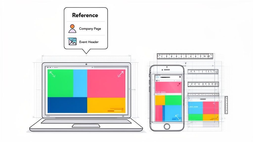
Getting your LinkedIn cover size right is the first step to making a sharp first impression. For a personal profile, you should use 1584 x 396 pixels. For a company page banner, the ideal size is 1128 x 191 pixels. Hitting these exact dimensions is key to making sure your profile looks professional on any device, avoiding any strange cropping or blurriness.
Your Quick Reference for LinkedIn Cover Photo Sizes
Think of your LinkedIn banner as your digital billboard. It’s often the first thing people see, and it instantly sets the tone for your personal brand or company. If that image is stretched, pixelated, or awkwardly cut off, it undermines your credibility before a visitor even reads a single word of your profile.
To take the guesswork out of it, we've pulled together all the essential specs into a simple reference table. This little cheat sheet has you covered for the main banner spots you will be designing for.
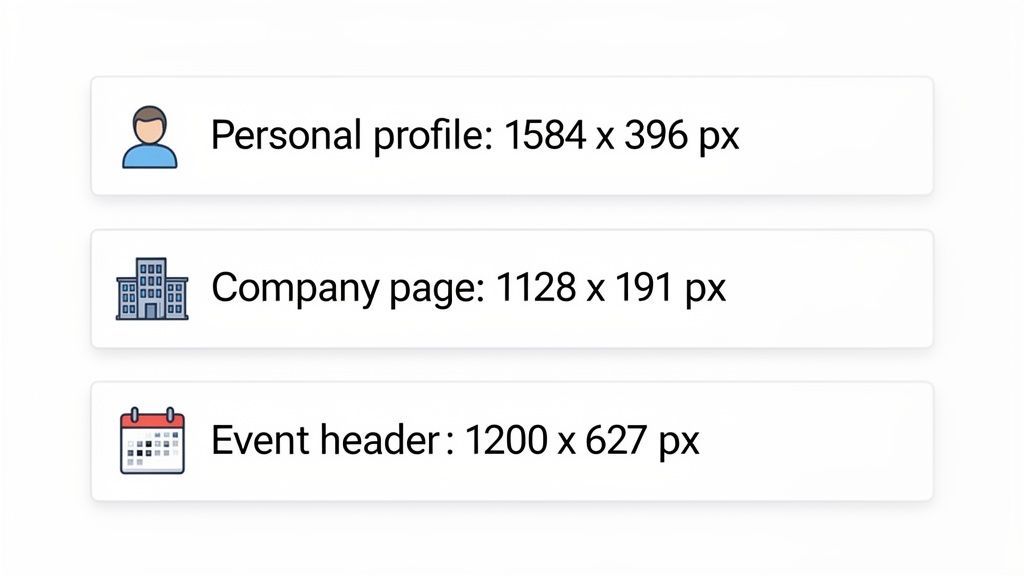
LinkedIn Cover and Banner Size Quick Reference
Here’s a quick summary of the current recommended dimensions, aspect ratios, and file specifications for all the major LinkedIn image types.
| LinkedIn Placement | Recommended Dimensions (Pixels) | Aspect Ratio | Maximum File Size |
|---|---|---|---|
| Personal Profile Cover | 1584 x 396 | 4:1 | 8MB |
| Company Page Banner | 1128 x 191 | 5.9:1 | 8MB |
| Event Header | 1776 x 444 | 4:1 | 8MB |
Consider these numbers your starting point. Whether you are firing up your favorite design tool or grabbing a template, beginning with these dimensions will save you a ton of headaches and frustrating upload errors down the line.
For a deeper look at every image spec on the platform, our complete guide to LinkedIn image sizes has everything you need. Knowing these details helps you create visuals that do not just look great but are also technically sound, guaranteeing a flawless presentation every time.
Designing Your Personal Profile Cover Photo
Think of your personal LinkedIn banner as your professional billboard. It’s the very first thing people see, setting the tone for your personal brand before they even read a word of your profile. The official size recommendation is 1584 x 396 pixels, and you really want to stick to that. It’s the key to keeping your image sharp and impactful on any device.
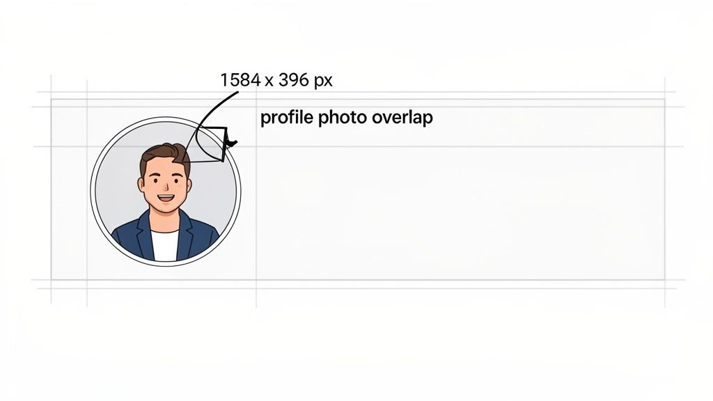
As you're designing, don't forget your profile picture will block out a chunk of the banner on the left. The exact spot it covers can shift a bit between desktop and mobile, so just avoid putting anything critical like a logo or text in that bottom-left area. It will almost certainly get cut off. A smart design will naturally draw the eye from your profile picture over to your main message on the right.
Getting these dimensions right is a must, especially in growing markets. Just look at Bulgaria, where LinkedIn users hit 1.402 million in October 2024, which is 21% of the whole country. For agencies and teams in BG using scheduling tools, it's a reminder that a sloppy, pixelated banner on a desktop view can kill a first impression before it even starts.
What to Include in Your Cover Photo
Your cover photo needs to do more than just fill space; it should instantly tell people what you’re all about. It’s a strategic piece of real estate that should work hand-in-hand with your headline and summary.
Here are a few ideas to put that banner to work for you:
- Showcase your expertise: Use a photo of you speaking at a conference, working with a client, or just a high-quality shot that reflects your industry.
- State your value proposition: Drop in a short, punchy tagline that says what you do and who you help. Something like, "Helping SaaS startups scale with data-driven marketing."
- Include contact information: You can add your professional website, email, or other social handles. Just make sure they're in the "safe zone," clear of where your profile picture sits.
- Highlight a recent achievement: Are you promoting a new book, a recent award, or a project you just wrapped up? Put it on your banner.
If you’re ready to move beyond a basic template and create something that really pops, you might want to consult a graphic designer. A well-designed cover photo can turn a passive profile view into an active one, making it immediately clear who you are and what you bring to the table.
Creating a Compelling Company Page Banner
Your company page banner is much more than just a pretty picture. It’s a huge piece of branding real estate that sets the tone for your whole business presence on LinkedIn. The magic number for a company page banner is 1128 x 191 pixels. That's a much wider, shorter canvas than a personal profile, giving you a different kind of space to play with.
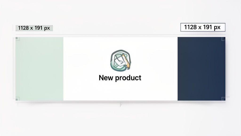
This space is your golden opportunity to flash your brand's identity, announce a new product, or plug an upcoming webinar. Unlike a personal banner, which is all about an individual's value, the company banner has to speak for the entire organization. It needs to be bold, instantly understandable, and tied directly into your marketing.
Great company banners use this space to tell a quick story or push people to act. A software company might show off a clean graphic of its UI with a tagline that screams "we solve this problem." A retail brand could use a vibrant lifestyle shot of its latest collection, making an instant connection with anyone who lands on the page.
Maintaining Brand Consistency
Consistency is everything for brand recognition, and your LinkedIn banner is a key player. It absolutely must use your company's official colors, fonts, and logo in a way that feels familiar to anyone who has seen your brand before. That consistent look builds trust and makes you look professional.
For teams trying to keep a company page sharp, keeping all the assets aligned can get messy. This is where a shared workspace is a lifesaver. Using a scheduler like PostFast lets your team pull from approved brand assets, work on designs together, and schedule updates from one place. It guarantees every visual, from the banner down to the smallest post, stays perfectly on-brand.
A well-designed banner doesn't just look good; it functions as a silent brand ambassador. It should be able to convey your company's core value proposition in the three seconds it takes for a visitor to form a first impression.
A smart banner strategy is not a one-and-done deal. Think about updating it to match current marketing campaigns, seasonal promos, or big company news. This keeps your page feeling alive and gives people a reason to check back. And do not just stick to static images; you could even explore how to create faceless videos for your LinkedIn presence to make your company's profile even more engaging. A strategic banner turns your company page from a simple profile into a serious marketing channel.
Mobile vs. Desktop Safe Zones: Don't Get Cropped
There's nothing worse than spending time on a sharp-looking cover photo, only to see it break on a different device. The image you perfected on your desktop monitor gets butchered on a phone, with your logo or tagline sliced in half. This is why you need to master the safe zones.
Think of the safe zone as the guaranteed-to-be-visible sweet spot in the middle of your banner. LinkedIn automatically crops and resizes your image for every screen, which means the edges are the first thing to go. Pushing your logo, text, or a key visual element to the far left or right is asking for trouble.
To nail it every time, keep all your critical information clustered near the center. A good habit is to leave a generous amount of clear space around all four edges of your design. This simple step keeps your message clear and your branding intact, no matter who's visiting your profile or how they're doing it.
Visualizing the Safe Zones
Seeing is believing. It really helps to visualize exactly how your banner gets trimmed when it moves from a wide desktop screen to a narrow mobile one.
LinkedIn gives us a pretty clear example in their own help documents, showing the difference between the desktop and mobile views.
As you can see, the mobile view is significantly narrower and more vertically focused. The left and right sides of your banner disappear completely on phones, making that central column your most valuable real estate.
Designing with these different views in mind is non-negotiable. When you're in your design tool, look for templates with built-in safe zone guides or create your own. For teams, this is even more critical. Using a scheduler like PostFast lets you create and store pre-approved templates that already account for safe zones. That way, anyone on the team can upload a banner that's perfectly optimized for all devices, keeping your brand looking consistently professional without a second thought.
Choosing the Right File Type and Size
Getting the dimensions perfect is only half the job. The file you actually upload is just as critical for a professional finish. LinkedIn has specific rules for the type and size of image you can use, and ignoring them almost always ends up giving you a blurry or pixelated cover photo. The platform is built to compress big images to keep loading times fast, which can absolutely wreck an otherwise perfect design.
Sticking to the right format from the get-go saves you from these quality headaches. You have two main choices for your cover image: JPG and PNG. Each has its own strengths, and knowing which one to use when is the secret to keeping your LinkedIn cover photo looking its best.
JPG vs PNG: Which Is Best
Deciding between a JPG or a PNG really just comes down to what's in your cover photo.
-
JPG (Joint Photographic Experts Group): This is your best bet for images with actual photographs or complex color gradients. JPGs use a compression method that is brilliant at handling millions of colors, which keeps the file size down without a noticeable drop in quality for photo-heavy content.
-
PNG (Portable Network Graphics): If your banner is mostly text, logos, or simple graphics with solid blocks of color, PNG is the way to go. PNGs use lossless compression, which means they preserve every single pixel of detail perfectly. This keeps your text and logos looking incredibly sharp and crisp.
The rule of thumb is simple: if it’s a photo, use a JPG. If it has sharp lines, text, or a logo, use a PNG.
No matter which format you pick, your file has to be under the 8MB maximum file size. Go over this limit, and you'll trigger LinkedIn’s automatic, and often aggressive, compression, which is the number one cause of blurry banners. When you export from your design tool, aim for the highest quality setting that keeps the file under that 8MB threshold.
This diagram shows you how to keep your essential elements visible, no matter what device someone is using.
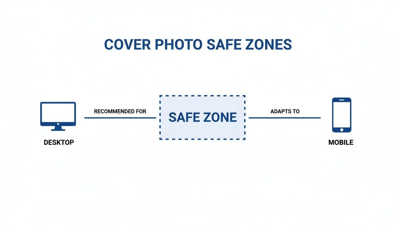
The main takeaway here is that the central area is your safe zone, making sure your message is never lost. If you're juggling multiple social profiles, you can find more helpful specs in our detailed guide on LinkedIn post sizes.
How to Upload Your New LinkedIn Cover
Got your optimized image ready? Great. Now for the easy part: getting it live on your profile. The process is quick, but the steps are slightly different for personal and company pages. Here’s a no-fuss walkthrough for both.
Whether you're polishing your personal brand or managing a corporate presence, sharp visuals are non-negotiable. This is especially true in growing markets. In Bulgaria, for instance, LinkedIn’s advertising audience is expected to hit a massive 23.9% of the total population by the end of 2025.
For anyone managing brand assets, this growth highlights the need for every image to load perfectly. A cover photo that's too large (over 8MB) can get compressed and look blurry. If you want to dive deeper into these trends, you can discover more insights about digital trends in Bulgaria.
Updating Your Personal Profile Cover
Let’s start with your personal page. This takes just a few clicks once you know where to go.
- Head to Your Profile: From the LinkedIn homepage, click the "Me" icon in the top right corner, then choose "View Profile."
- Find the Edit Icon: Look for the small pencil icon in the top right of your current cover photo. Click it.
- Upload and Adjust: A pop-up will appear. Select "Upload photo" and pick your new banner file. You can drag to reposition, zoom, or even apply a few basic filters before you hit "Apply" to save it.
Changing a Company Page Banner
The steps for a company page are almost identical, but you’ll start from the admin view.
- Go to Admin View: Navigate to your company page. Make sure you’re viewing it as an administrator.
- Click to Edit: Hover over the banner, and a pencil icon will pop up. Click it.
- Upload and Save: Choose "Upload cover image," select your file, and drag it into the perfect position. Once you’re happy, click "Save," and your new banner is live.
Manually updating banners across multiple client pages is a real time-sink for agencies. A tool like PostFast lets you manage and schedule all your brand assets from a single dashboard, keeping everything consistent, especially during a brand-wide rollout.
If you’re interested in automating more of your workflow, check out our guide on how to use the LinkedIn API for posting.
LinkedIn Banner FAQs
You've got the dimensions, but a few questions might still be bubbling up. Getting your LinkedIn cover size just right can feel a bit fussy, so let's clear up the common sticking points.
These are the answers you need to get your design finalized and looking sharp.
What Happens If My LinkedIn Cover Is the Wrong Size?
If your banner does not quite match the official specs, LinkedIn takes a guess and tries to fix it. It will automatically stretch, crop, or compress the image to make it fit.
The result is almost always a blurry, pixelated, or awkwardly framed banner that just looks unprofessional. Key info like your logo or tagline can get sliced off, especially on mobile where the cropping is much more aggressive. Stick to 1584 x 396 pixels for personal profiles and 1128 x 191 pixels for company pages to make sure your image shows up exactly as you designed it.
Can I Use a GIF for My LinkedIn Cover Photo?
Short answer: no. LinkedIn does not support animated GIFs for cover photos on either personal or company pages right now. You can upload a GIF file, but it won’t play.
Instead, LinkedIn just grabs the very first frame and displays it as a static image. For a clean, professional look, stick to static formats. A crisp PNG is great for text and logos, while a high-quality JPG works best for photos.
How Often Should I Update My LinkedIn Banner?
There’s no hard-and-fast rule here, but strategically updating your banner is a smart move to keep your profile feeling current. Think about refreshing it every quarter to align with a new campaign, or anytime you have a big announcement like a product launch.
For your personal profile, updating your banner every six to twelve months, or whenever you switch roles, is a great way to keep it fresh. A scheduler like PostFast lets you plan these updates ahead of time, so your profile always reflects what you’re focused on now.
What Are the Dimensions for Other LinkedIn Covers?
Beyond your personal profile and company page, a few other placements on LinkedIn have their own unique specs you need to nail.
- LinkedIn Events: The event header banner should be 1776 x 444 pixels.
- LinkedIn Groups: The cover for a group uses the same dimensions: 1776 x 444 pixels.
Always double-check the latest guidelines for these specific spots. Getting the LinkedIn cover size right is the first step to making sure your visuals actually work.
Juggling all these different sizes while keeping your brand looking consistent is a real headache. With PostFast, you can manage, schedule, and update all your social media visuals from one clean dashboard. It saves you time and makes sure your profiles always look professional. Try PostFast for free and see how simple it can be.
Related articles
Best AI Tools for Social Media Management in 2026 (Honest Guide)
The best AI tools for social media management in 2026: honest picks for drafting, scheduling and agent-run workflows, plus copy-paste ChatGPT prompts.
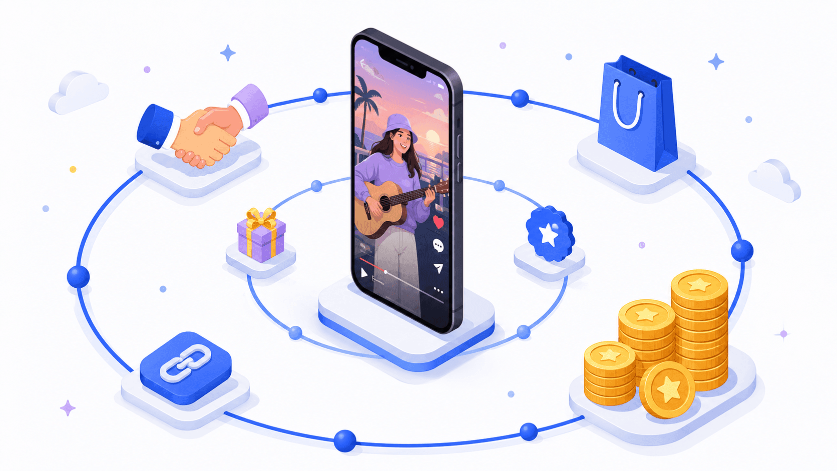
10 Ways to Make Money with AI in 2026 (Ranked by Realism)
The ways to make money with AI in 2026 that actually work, ranked by realism: AI-powered services, content systems, products and the traps to skip.
How to Make Money on Social Media in 2026: 8 Models That Actually Pay
How to make money on social media in 2026: the 8 income models, real platform payout thresholds compared, and the consistency math behind creators who earn.
How to Make Money on Instagram in 2026 (Real Numbers, No Hype)
How to make money on Instagram in 2026: the real follower thresholds for gifts and subscriptions, why brand deals pay most, and the math at every audience size.
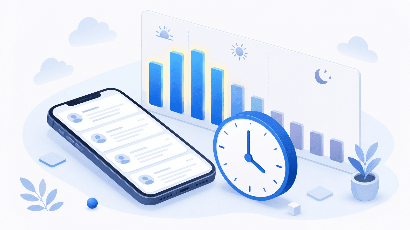
Best Time to Post on X (Twitter) in 2026: A Practical, Data-Informed Guide
The best time to post on X (Twitter) in 2026: day-by-day windows, when 9,339 real scheduled posts actually publish, and how to find your own peak hours.
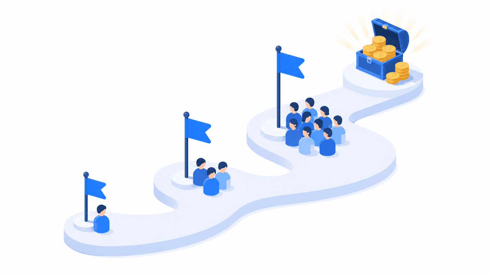
How Many Followers on TikTok Do You Need to Get Paid?
How many followers you need to get paid on TikTok in 2026: 0 for some paths, 1,000 for LIVE and Shop, 10,000 for Creator Rewards. Plus the views math.