A Guide to Perfect Facebook Cover Photos
Master your Facebook cover photos with our complete guide. Learn the right dimensions, design tips, and creative ideas to make your profile stand out.
On this page (6)
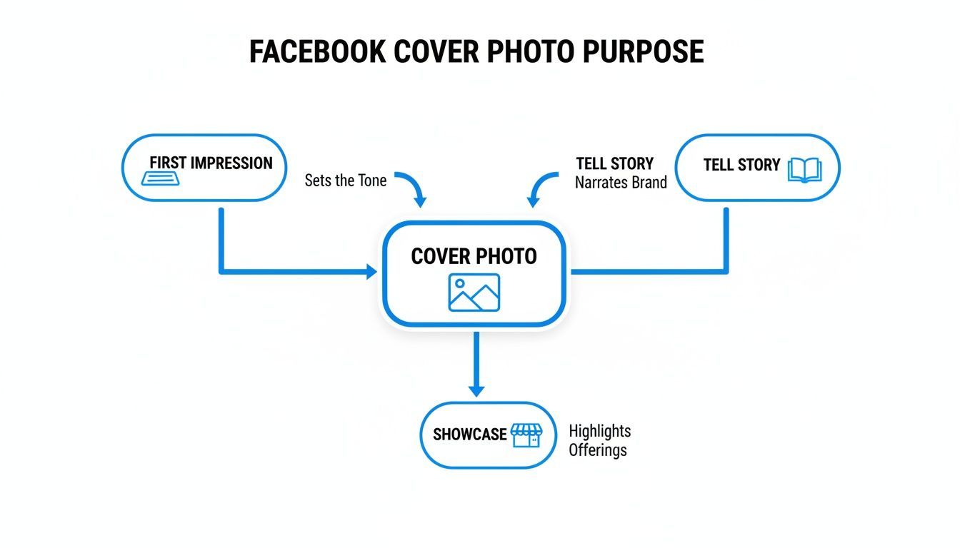
Your Facebook cover photo is your digital welcome mat. It’s the first visual handshake you give visitors, and it does a lot of heavy lifting to set the tone for your entire page.
This isn't just about finding a nice picture. It's a powerful branding space that can instantly tell people who you are, whether you're a creator building a personal brand or a business managing a professional profile.
Your Digital First Impression
Think about the last time you walked past a shop. What made you look twice? Was it the window display, the sign, or just the general vibe from the entrance? Your Facebook cover photo does that exact job online.
It’s that huge piece of visual real estate right at the top of your page, and it’s one of the first things people see. That single image can immediately communicate your identity, what you care about, and why someone should stick around. A well-chosen cover photo doesn't just fill empty space; it’s an active part of how you communicate. You can use it to tell a story, announce something big, or show off your most popular products. It’s a dynamic banner that should change as your goals change.
Why Your Cover Photo Matters
In a crowded social feed, you have seconds to make an impression. A blurry, poorly cropped, or generic cover photo might signal that you don't pay attention to the details. On the flip side, a sharp, creative, and on-brand image feels professional and helps build trust right away.
Here’s what a great cover photo can do for you:
- Establish Brand Identity: It immediately shows off your personality through colors, fonts, and imagery.
- Promote Current Offers: Use this space to announce a sale, a new product, or a special event.
- Increase Engagement: A compelling or interactive cover photo can encourage visitors to dig deeper into your page.
- Drive Specific Actions: Pair it with your page’s call-to-action button to guide users to shop now, sign up, or learn more.
Moving Beyond a Static Image
The biggest mistake people make is treating their cover photo as a "set it and forget it" element. Your page should feel alive and current, and your cover photo is the perfect tool for that.
Imagine scheduling a new cover photo to go live the second a holiday sale begins, or automatically updating it to celebrate a company milestone. This keeps your profile feeling relevant and organized, not stale.
Your cover photo isn't just a background image; it’s a strategic billboard. When you keep it fresh and aligned with your current marketing goals, you transform a static profile into an active, engaging destination for your followers.
This guide will walk you through everything, from nailing the dimensions to designing visuals that truly represent your brand. We'll give you clear, practical steps to create a cover photo that works hard for you and is easy to update.
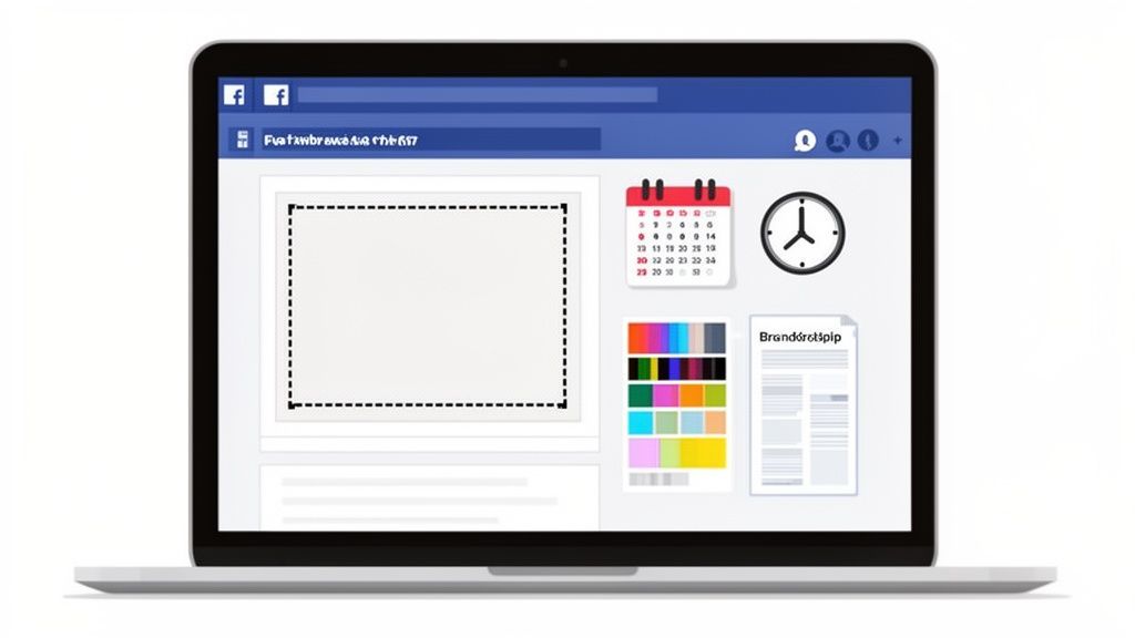
Getting the Dimensions Right
Your Facebook cover photo is the first thing people see. To make it look sharp and professional, you have to start with the right dimensions. This might sound like a minor technical detail, but it’s the foundation for a great first impression. Get it wrong, and your image ends up blurry or awkwardly cropped.
Think of it like framing a picture for a gallery. An ill-fitting frame makes the art look amateurish. The same goes for your cover photo, the right size ensures your brand's "art" is displayed exactly as you planned.
Desktop vs Mobile: The Great Divide
The biggest headache with Facebook cover photos isn't just one set of numbers; it's how the image changes across different devices. What looks perfect on a wide desktop monitor can get completely butchered on a vertical mobile screen.
Facebook doesn't stretch your image; it crops it. On a desktop, your cover photo displays at 820 pixels wide by 312 pixels tall. But on a phone, it shows up as 640 pixels wide by 360 pixels tall. See the problem? It’s narrower but taller on mobile, and that’s where most designs fall apart.
This is why understanding the purpose of your cover photo is so important. It has to make a great first impression, tell a story, and show off what you do, all while looking good everywhere.
Getting the dimensions right is the first step to making sure your cover photo can do its job on every single device.
Understanding the Safe Zone
The trick to solving this cropping issue is to design with a "safe zone" in mind. This is the central sweet spot of your image that stays visible whether someone is viewing it on their laptop or their phone. All your critical info, your logo, tagline, or the main subject of your photo, needs to live inside this mobile-friendly area.
Think of it like this: your desktop cover photo is a widescreen movie. The mobile view is like watching that same movie on a tall, skinny TV. You lose the sides of the picture, but you might see a little more at the top and bottom. The safe zone is the part of the scene everyone can see clearly, no matter which screen they're using.
The secret is to upload an image that's 820 pixels wide by 360 pixels tall. This size gives you a larger canvas that works for both views. Just keep all the important stuff centered, and you can be sure nothing critical gets cut off.
The details matter. For instance, PostFast data shows that in Bulgaria, where Facebook has a 97.05% market share, a perfectly sized cover photo paired with the right profile picture placement can make a huge difference in engagement. It’s all about creating a seamless look that works with how the platform is actually used.
Facebook Cover Photo Dimensions and Safe Zones
Getting the numbers right from the start saves a ton of frustration. If you upload an image that’s too small, Facebook will stretch it to fit, making it look pixelated and blurry. Always begin with a high-resolution image to give the platform the best possible material to work with.
Here’s a quick reference table to keep the key numbers handy.
| Device | Display Size (Pixels) | Recommended Upload Size (Pixels) | Visible Safe Zone Notes |
|---|---|---|---|
| Desktop | 820 x 312 | 820 x 360 | The full width is visible, but the top and bottom edges get a slight crop. |
| Mobile | 640 x 360 | 820 x 360 | The sides are cropped off, but more of the height is visible. Keep key info in the center. |
One last thing: file type matters. If your cover is a photograph, a JPG is your best bet. If it has text, logos, or sharp graphics, save it as a PNG to avoid that fuzzy look that compression can cause. Keeping your file size under 100KB also helps it load quickly for your visitors. For a deeper dive, check out our detailed guide for all Facebook cover photo sizes.
Design Principles for a Standout Cover Photo
Okay, you’ve got the technical specs down. Now for the fun part: making your cover photo actually look good. A great cover isn't just about fitting the right dimensions; it's a strategic piece of design that tells people who you are in a single glance.
The goal here is a visual that’s clean, clear, and compelling. You want visitors to instantly get what you’re about without feeling overwhelmed by a cluttered mess. This all comes down to the fundamentals: branding, hierarchy, and composition.
Maintain Consistent Branding
Think of your Facebook page as a digital storefront. It’s an extension of your brand, and the cover photo should make that connection instantly. Consistency builds recognition and trust; a jumble of different styles just confuses your audience and weakens your identity.
Start with your core brand elements:
- Colors: Stick to your brand’s primary and secondary colors. A consistent palette makes your page instantly familiar to anyone who’s seen you on other platforms.
- Fonts: If you're adding text, use your brand's typography. This small detail ensures any message feels like it's coming directly from you.
- Imagery Style: Whether your vibe is minimalist graphics, vibrant photos, or professional headshots, keep the style consistent with your overall brand aesthetic.
Create a Clear Focal Point
When someone lands on your page, their eyes need a place to go. That’s your focal point. Without one, their gaze just wanders, and your core message gets completely lost. One of the most common mistakes is cramming too many things into the image, all competing for attention.
Your focal point could be a new product, a powerful headline, or even a person's face. The trick is to make it the most dominant thing on the screen. You can do this with size, a pop of contrasting color, or by placing it right in the center. A brightly colored button against a muted background, for instance, will naturally pull the eye.
A cover photo should have one clear job. Decide what that job is, announcing a sale, showcasing your work, or building a personal brand, and make sure every design choice supports that single goal.
This focused approach helps your cover photo make an immediate impact instead of just creating visual noise.
Use Visual Hierarchy and Negative Space
Visual hierarchy is just a fancy way of saying you should organize things to show what's most important. Your most critical info, like an event date or a promo code, should stand out the most. Use bigger fonts, bolder colors, or prime real estate to guide the viewer’s eye from the main event down to the smaller details.
Just as important is negative space, the empty area around your design elements. Don’t be afraid of it! All that breathing room is what makes your focal point pop, reduces clutter, and gives your design a polished, professional feel. A crowded cover feels chaotic; one with plenty of negative space feels calm and confident. For more tips on crafting clean visuals, our guide on achieving perfect 16:9 resolutions has some useful insights into composition.
Harmonize Your Cover and Profile Picture
Finally, remember your cover photo and profile picture are a team. They’re always seen together, so they should work together. Some of the most clever pages make these two elements interact in creative ways.
For example, your profile picture could be your logo, while the cover photo behind it shows off your office or team. Or you can get really creative and have a graphic that seems to flow from the cover right into the profile picture space. This kind of thoughtful integration shows you care about the details and gives your page a polished look that really stands out.
Creative Ideas and Real-World Examples
Knowing the design rules is one thing, but seeing them in action is what really makes things click. If you're stuck for an idea, think of this section as your personal inspiration gallery. We've pulled together some great examples of Facebook cover photos, broken down by what they're trying to accomplish.
Instead of just telling you what works, we’re going to show you. Each idea is a launchpad you can adapt for your own page. From a new product drop to celebrating your team, a great cover photo can do some heavy lifting.
Announce an Upcoming Event or Launch
Your cover photo is the perfect billboard for big news. It’s the very first thing people see, making it prime real estate for building hype around a webinar, product launch, or special promotion.
Use a sharp, high-quality image that instantly tells the story of what’s coming. Add the essential details, date, time, a catchy headline, but keep the text light. The goal here is to create intrigue and guide people straight to your call-to-action button, whether that’s "Sign Up" or "Learn More."
A restaurant, for example, could tease a new seasonal menu with a mouth-watering shot of a signature dish and the launch date in bold. A software company might give a sneak peek of a new feature, nudging people to sign up for a beta test.
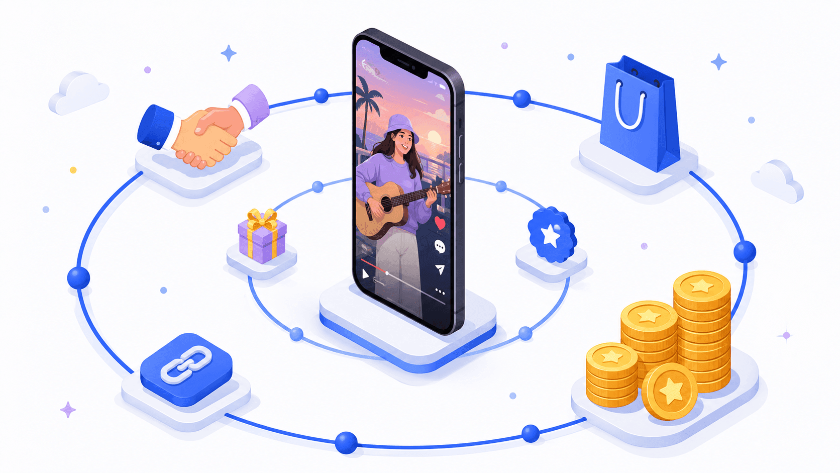
Showcase Your Products or Services
Think of your cover photo as a visual storefront for what you do best. This works incredibly well for e-commerce brands, artists, and any service-based business. You could feature a single hero product in a stunning lifestyle shot or create a clean collage of your best-sellers.
Remember to show, not just tell. Instead of a sterile product shot on a white background, show someone actually enjoying it. This simple shift helps potential customers imagine themselves using your product, making it far more relatable and desirable.
Your cover photo isn't just a banner; it's a storytelling canvas. Use it to answer the question, "What problem do you solve for me?" A photo of someone enjoying your product does this far more effectively than a list of features.
This strategy helps lock in your brand identity and keeps your most valuable offerings right at the top of the page. It's a constant, subtle reminder of why people should be following you in the first place.
Tell Your Brand Story
What’s your brand’s mission? Who are the actual people making it all happen? Your cover photo is a powerful way to humanize your business and build a real connection with your audience.
A shot of your team collaborating, a behind-the-scenes glimpse of your creative process, or an image that reflects your company values can be incredibly effective. It tells visitors you’re more than just a logo, you’re a group of real people working toward something you believe in.
This is especially critical in a market dominated by Facebook's 93.99% share. Wasting such a prime branding opportunity is a huge mistake. For agencies juggling multiple clients, tools with team workspaces like PostFast can automate these visual updates across different profiles. This saves hours while delivering real-time engagement data to fine-tune their strategies. You can discover more insights about the social media market in Bulgaria.
Go Beyond the Static Image
Your creativity doesn't have to stop at a single, static picture. Think about how you could use a series of cover photos over time to tell a longer story or run a full-blown campaign.
- Weekly Themes: Feature a new product, team member, or customer story each week.
- Holiday Countdown: Change the cover photo daily or weekly to build excitement for a major holiday or sale.
- Sequential Storytelling: Use a series of three or four cover photos over a month to tell a short story about your brand.
For those looking for unconventional or humorous ideas, an AI meme generator can be a fun way to create visual content that grabs attention. By thinking dynamically, your Facebook page becomes a more engaging and unpredictable destination for your followers.
How to Keep Your Cover Photo Fresh and Engaging
A great Facebook cover photo isn't a "set it and forget it" asset. If you really want to grab attention and keep people coming back, your cover photo needs to be as dynamic as your brand. Treating it like static wallpaper is a huge missed opportunity to show people what’s new and exciting.
Think of it as the headline feature on your page. When it changes, regular visitors notice. That simple update signals your page is active and has fresh stuff to check out, which can seriously boost engagement over time.
Plan Your Updates with a Content Calendar
The best way to handle your cover photo is to stop treating updates as a last-minute scramble and start planning them. When you bake cover photo changes into your regular content calendar, you ensure your page always reflects your current marketing goals.
This approach keeps you organized and strategic. You can map out your visual branding for key moments well in advance, making sure you’re always on point.
Think about scheduling updates for specific occasions:
- Seasonal Campaigns: Swap in a new cover for winter holidays, summer sales, or back-to-school promotions.
- Company Milestones: Got an anniversary, a big win, or a team expansion? Celebrate it with a special design.
- Product Launches: Build hype for a new product or feature by making it the hero of your cover photo.
- Events and Webinars: Use that prime real estate to promote upcoming events and drive registrations right from your page.
This kind of strategic rotation keeps your profile feeling current and gives you another channel to reinforce marketing messages without cluttering up the feed.
Automate Your Changes for Maximum Efficiency
Manually changing your cover photo at the perfect moment, like the instant a flash sale goes live, is stressful and easy to forget. This is where a scheduling tool becomes a game-changer, turning a manual chore into an automated part of your strategy.
With a platform like PostFast, you can queue up your Facebook cover photos weeks or even months ahead. Imagine setting up your entire holiday campaign's visual branding in October, knowing each cover will switch over automatically at just the right time. That frees you up to focus on actually talking to your community instead of fussing with profile maintenance.
Planning your cover photo updates is a simple but powerful way to maintain a professional and active presence. It shows your audience that you pay attention to the details and are consistently working to provide them with relevant content.
This is especially critical in active markets. For example, Facebook's presence in Bulgaria is massive, with an expected 3.6 million active users by late 2025. For creators and marketing teams there, smart scheduling is essential to align cover refreshes with local events and holidays, boosting visibility where it counts. You can check out more insights about the social media landscape in Bulgaria to see how a planned approach makes a difference.
At the end of the day, keeping your cover photo fresh is about more than just looking good. It’s a low-effort, high-impact tactic for driving engagement, promoting your latest initiatives, and making sure your digital first impression is always a strong one. By using powerful scheduling features, you can make this process seamless and keep your brand looking polished and timely, always.
Common Questions About Facebook Cover Photos
Got a few lingering questions? Perfect. This section is a quick-fire round of answers to the most common head-scratchers we see. Think of it as a troubleshooter for the small details that make all the difference.
Can I Use a Video for My Facebook Cover?
Yes, and you absolutely should if you want to grab attention. A cover video needs to be between 20 and 90 seconds long, and you’ll want to design it at 820 x 462 pixels.
Just remember that videos autoplay on mute, so your visuals have to do all the heavy lifting. Tell a story without sound. It's also worth knowing that cover videos don’t play on the mobile app, users will just see the static thumbnail you’ve chosen instead.
How Do I Stop My Cover Photo from Looking Blurry?
Ah, the dreaded blur. This is usually Facebook’s image compression at work. The best way to fight it is to give Facebook a high-quality image to start with. Make sure it's at least 820 pixels wide. A larger, cleaner file gives the platform more data to work with, which usually means a sharper result.
Also, a pro tip: if your design has any text or a sharp logo, save it as a PNG file, not a JPG. PNGs are way better at keeping crisp lines and solid colors sharp, which stops that fuzzy, compressed look. Trying to keep the file size under 100KB can also help you sidestep the heaviest compression.
What Common Mistakes Should I Avoid?
The number one mistake, hands down, is forgetting about the mobile safe zones. It’s so easy to design a beautiful cover on your desktop, only to realize the sides get chopped off on a phone, cutting right through your headline or logo. Always, always design with a mobile-first mindset.
A few other common pitfalls include:
- Using Generic Stock Photos: Your cover photo is prime real estate. It should scream your brand, not look like an image anyone could grab for free.
- Creating Too Much Clutter: Don't try to cram your life story into that small space. Too much text or too many design elements just overwhelm people. Simple is almost always better.
- Forgetting to Update It: A cover photo promoting an event from last month or a winter sale in July makes your page look abandoned.
Your cover photo should always be relevant to what's happening with your brand right now. An outdated banner suggests an outdated page, which can quickly turn away potential followers.
How Often Should I Update My Cover Photo?
There’s no magic number here, but a solid rule of thumb is to change it whenever you have something new to say. This keeps your page looking active and gives loyal followers a reason to pay attention.
You could update it monthly to match a new content theme, quarterly for the seasons, or for specific campaigns like a product launch or a holiday sale. The goal is to make sure your cover photo is always pulling its weight and supporting your current marketing goals. It shows your audience you’re active, engaged, and worth following.
Managing a dynamic calendar for your Facebook cover photos doesn't have to be a manual headache. With a smart scheduling tool like PostFast, you can plan all your updates well in advance, from seasonal refreshes to big campaign launches, ensuring your profile is always polished and perfectly timed. Start your free trial of PostFast today and automate your brand's first impression.
Related articles

Best AI Tools for Social Media Management in 2026 (Honest Guide)
The best AI tools for social media management in 2026: honest picks for drafting, scheduling and agent-run workflows, plus copy-paste ChatGPT prompts.

10 Ways to Make Money with AI in 2026 (Ranked by Realism)
The ways to make money with AI in 2026 that actually work, ranked by realism: AI-powered services, content systems, products and the traps to skip.

How to Make Money on Social Media in 2026: 8 Models That Actually Pay
How to make money on social media in 2026: the 8 income models, real platform payout thresholds compared, and the consistency math behind creators who earn.
How to Make Money on Instagram in 2026 (Real Numbers, No Hype)
How to make money on Instagram in 2026: the real follower thresholds for gifts and subscriptions, why brand deals pay most, and the math at every audience size.

Best Time to Post on X (Twitter) in 2026: A Practical, Data-Informed Guide
The best time to post on X (Twitter) in 2026: day-by-day windows, when 9,339 real scheduled posts actually publish, and how to find your own peak hours.

How Many Followers on TikTok Do You Need to Get Paid?
How many followers you need to get paid on TikTok in 2026: 0 for some paths, 1,000 for LIVE and Shop, 10,000 for Creator Rewards. Plus the views math.