The Ultimate Guide to LinkedIn Banner Size and Best Practices
Master the perfect LinkedIn banner size with our complete guide. Learn dimensions, safe zones, and tips to make your profile stand out professionally.
On this page (17)
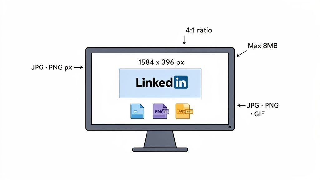
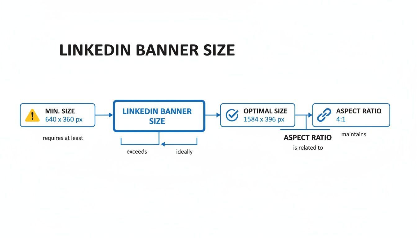
Your LinkedIn banner is the first thing people see when they visit your profile. Getting the dimensions right is crucial for that sharp, professional look. For a personal profile banner, the perfect size is 1584 x 396 pixels.
Nailing these specs ensures your header looks crisp and avoids any awkward stretching or cropping.
Your Quick Reference for LinkedIn Banner Dimensions
Think of your banner, often called a cover photo, as prime real estate for your personal brand or company. A pixelated or badly cropped image can subtly undermine your credibility, so it's worth getting it right.
Sticking to the official guidelines guarantees a clean presentation on every device, from wide desktop monitors to smaller mobile screens. Beyond just the pixel dimensions, you also need to keep an eye on the aspect ratio, file type, and file size to avoid upload errors.
LinkedIn Banner Specifications at a Glance
Here is a simple table to quickly reference the different banner specs for personal profiles versus company pages. They are not the same, which is a common stumbling block.
| Specification | Personal Profile Banner | Company Page Cover Image |
|---|---|---|
| Recommended Dimensions | 1584 x 396 pixels | 1128 x 191 pixels |
| Aspect Ratio | 4:1 | Approx. 5.9:1 |
| Maximum File Size | 8 MB | 8 MB |
| Accepted File Types | JPG, PNG, non-animated GIF | JPG, PNG, non-animated GIF |
As you can see, the dimensions differ significantly, so be sure to create separate assets if you manage both a personal and a company presence.
Key Banner Specs You Can't Ignore
Let's break down the must-know numbers for a flawless banner upload every time:
- Personal Profile Dimensions: Use 1584 x 396 pixels for the best results.
- Company Page Dimensions: The cover image here is much wider and shorter, at 1128 x 191 pixels.
- Aspect Ratio: A clean 4:1 ratio is what you're aiming for on a personal banner.
- Maximum File Size: Keep your image under 8 MB. Anything larger will be rejected.
- Supported File Types: LinkedIn accepts JPG, PNG, or non-animated GIF files.
For a complete look at all the different image specs across the platform, from profile pictures to post images, check out our comprehensive guide on LinkedIn image sizes.
Getting the LinkedIn Banner Size Right
Let's get straight to the numbers. LinkedIn's official recommendation for your banner is 1584 x 396 pixels. Think of this as the optimal size, not just a minimum to scrape by. Using these exact dimensions is the single best thing you can do to prevent strange cropping and make sure your banner looks sharp on any device.
Here is why it matters. If you upload a smaller image, LinkedIn has to stretch it out, which leads to that fuzzy, pixelated look. Go too large with the wrong proportions, and the platform will just chop off parts of your image, potentially slicing away key details. Sticking to the recommended size puts you in full control.
Why the 4:1 Aspect Ratio Is Your Best Friend
Beyond just the pixel count, the aspect ratio is what keeps your banner looking consistent everywhere. That 1584 x 396 dimension works out to a 4:1 aspect ratio, meaning the banner's width is precisely four times its height. This ratio is your secret weapon for a professional look.
When your banner holds that perfect 4:1 shape, it scales predictably. It will not get squashed on a huge desktop monitor or distorted on a narrow phone screen. It just works.
Ignoring the ratio is a very common mistake. Even if your pixel dimensions are close, a mismatched ratio will cause unexpected cropping. Your profile picture and other parts of the LinkedIn interface also cover up sections of your banner, which we'll get into when we talk about safe zones. For now, just lock in 1584 x 396 pixels and that 4:1 ratio. If you want to go deeper on all the platform's image specs, this guide on mastering LinkedIn's image size requirements is an excellent resource.
Designing for All Devices and Safe Zones
Your LinkedIn banner will not just be seen on a perfectly sized desktop monitor. It shows up on everything from massive ultra-wide screens to tiny mobile phones, and each one displays it a bit differently. This is why understanding safe zones is absolutely necessary for a design that actually works.
Think of the safe zone as the core real estate of your banner, the central bit that stays visible no matter what device someone is using. This is where you absolutely must place critical elements like your logo, tagline, or contact info to make sure they do not get chopped off.
Navigating Overlapping Elements
Another thing to keep in mind is how LinkedIn's own interface elements will sit on top of your banner. On a personal profile, for instance, your profile picture will always cover the bottom-left corner. On mobile, the banner gets cropped even more on the sides, and other UI bits can pop up.
To help you visualize all this, the infographic below breaks down the key dimensions and safe areas.
This visual guide is your cheat sheet. It reinforces the optimal size and aspect ratio, which are the building blocks for a design that looks good everywhere.
A great habit to get into is previewing your design on a few different screen sizes before you hit upload. Just stick to one simple rule: keep your main message, logo, and any call to action right in the center. That way, your own profile photo or the platform's layout will not end up hiding your most important branding.
Key Takeaway: Always design for the smallest screen first. If your essential info is clear and legible on a mobile phone, it will almost certainly look great on a bigger desktop display. This mobile-first approach keeps your branding consistent and professional for every single visitor.
While your banner sets the stage, remember it's just one piece of your profile. For guidance on creating visuals for your updates, you might be interested in our guide on the correct LinkedIn post size.
Optimizing Your Banner Image File
A great design is only half the battle. Your banner also needs to load quickly and look sharp on every screen. This all comes down to the file itself, specifically, its format and size. No matter what, you have to keep the final image under LinkedIn’s 8MB limit.
The file format you choose makes a huge difference. For most banners, especially those with photos, JPG (or JPEG) is your best bet. It hits that sweet spot between good quality and a small file size by using smart compression.
But if your banner is heavy on graphics with sharp lines, crisp text, or needs a transparent background, then PNG is the way to go. PNGs keep every pixel perfect without any compression loss, but the trade-off is usually a much larger file. LinkedIn also accepts GIFs, but just know they have to be static, not animated.
Choosing the Right Export Settings
When you’re ready to save your banner from a tool like Canva or Photoshop, your export settings are critical. This is the final step that determines whether your sharp design stays sharp or ends up looking fuzzy after you upload it.
Here are a few quick tips for a perfect export every time:
- For JPGs: Aim for a quality setting somewhere between 70% and 90%. This range almost always gives you great-looking results while keeping the file size well under the limit.
- For PNGs: If you need a PNG, use the "Save for Web" option in tools like Photoshop. It does a great job of shrinking the file size without wrecking the quality.
- Color Profile: Always, always export using the sRGB color profile. It is the standard for everything on the web, and it ensures your brand colors look the same on every browser and device.
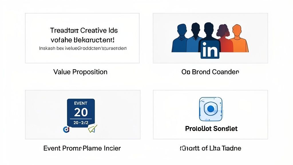
Creative Ideas for Your LinkedIn Banner
Don't let your LinkedIn banner be a throwaway background image. Think of it as prime real estate, a powerful communication tool that tells visitors who you are and what you do in a single glance. A well-designed banner can actively support your professional goals, so ditching the generic photo is a must.
The whole point is to use this space to showcase your unique value proposition. What makes you or your company stand out? If you're a specialist in a specific niche, your banner is the perfect spot to state that loud and clear.
It’s also your chance to visually reinforce your brand. Using consistent colors, fonts, and logos that match your website or other professional materials creates a cohesive identity. That consistency is what builds recognition and trust with your audience.
Ways to Use Your Banner Space
Ready to transform your banner from a simple backdrop into a strategic asset? Here are a few actionable ideas that grab attention and communicate your value.
- Highlight Key Services or Products: A freelance writer could list their specialties like "SEO Content," "Copywriting," and "Email Marketing." A software company might feature icons of its main products.
- Promote an Event or Launch: Hosting a webinar or launching a new book? Use your banner to announce it. Be sure to include the date and a clear call to action.
- Showcase Accomplishments or Testimonials: Feature a key achievement, a prestigious award, or a short, punchy quote from a happy client. This is instant social proof.
- Feature Your Team or Company Culture: A shot of your team collaborating or at a company event can humanize your brand and make you far more relatable.
Your banner is a silent salesperson working for you 24/7. Use it to communicate your core message without saying a word. Make sure it answers the question, "Why should I connect with you?"
Ultimately, the best banner is one that aligns with your specific goals. Whether you want to generate leads, build authority, or attract talent, a creative and well-designed background image sets the stage for meaningful connections. A tool like PostFast can help you schedule content that complements your banner’s message, keeping your profile’s branding tight and consistent.
Your LinkedIn Banner Is Just the Start
A great banner makes a strong first impression, but it's the consistency across your entire profile that really builds trust and recognition. When your daily posts, articles, and comments all align with the look and feel of your banner, you're presenting a polished, professional brand that people remember.
Keeping all that content visually aligned can feel like a full-time job. This is where a tool like PostFast comes in. It lets you schedule your posts so they complement your banner’s core message, ensuring your profile always looks cohesive and intentionally designed.
Keep Your LinkedIn Strategy Cohesive
Instead of scrambling to post visuals manually every day, you can plan and publish everything from one place. This is not just a time-saver; it’s a strategic advantage in a rapidly growing professional space. For instance, LinkedIn users in Bulgaria shot up to 1.60 million by the end of 2025, a 14.3% jump in just one year. You can dig into those numbers in the digital report for Bulgaria.
This growth highlights why a strong visual identity, starting with a perfectly sized banner, is so important. But remember, the banner is just one piece of a much larger puzzle. It needs to fit into a comprehensive LinkedIn Profile Optimization strategy. To see how it all connects, take a look at our complete guide to succeeding on LinkedIn in 2026.
Common Banner Problems and How to Fix Them
Even when you nail the recommended LinkedIn banner size, you can still run into glitches. From blurry images to strange cropping, most issues are a quick fix once you know what you're looking for. A clean, sharp banner is just a few clicks away.
One of the most common headaches is a banner that looks pixelated or blurry after you upload it. This usually happens when LinkedIn over-compresses your file because it was saved at too low a quality, even if the dimensions were spot on.
Solving Blurriness and Cropping Issues
To fix a blurry banner, re-export your image as a high-quality JPG (around 80-90%) or, even better, a PNG-24. This keeps more of the original detail, giving LinkedIn a much better file to work with and leaving you with a crisp final image.
If your banner is being cropped strangely despite being the correct 1584 x 396 pixels, the problem is almost always the safe zone. Your profile picture and other interface elements will cover parts of the banner, and it looks different on every device. Keep your essential text and logos packed near the center of the image to make sure they are always visible.
Another frequent problem is the upload failing completely. This is almost always down to two things:
- File Size: Your banner must be under 8MB. No exceptions.
- File Format: LinkedIn only accepts JPG, PNG, or non-animated GIF files.
Check those two specs first. Nine times out of ten, that's what's holding you back, and fixing it will get your upload to go through smoothly.
LinkedIn Banner FAQs
Got a few last questions about getting your LinkedIn banner just right? We see the same handful of queries pop up all the time. Here are some quick answers to help you lock in your design.
The most common question is about personal vs. company page banners. As we've covered, they are not interchangeable. A personal banner is 1584 x 396 pixels, but a company cover image is a much wider, shorter strip at 1128 x 191 pixels. You'll definitely need a separate design for each.
Another one we get a lot is about animated GIFs. While you can upload a GIF file, LinkedIn will only display it as a static image. It will not play any animation, so stick to JPGs or PNGs for your banner.
How Often Should I Update My Banner?
There is no hard-and-fast rule here, but it's smart to refresh your banner every few months or whenever you have something new to share. A stale banner can make your profile look inactive.
Consider a quick update to spotlight things like:
- A new product launch or service you're offering.
- An upcoming webinar or event you're hosting.
- A major award or company accomplishment.
- A seasonal campaign or important milestone.
For a fast and free way to create banners, tools like Canva or Adobe Express have pre-sized templates ready to go. Just pop in your info, export, and you're done, no fussing with the dimensions.
Ready to keep your entire LinkedIn presence as fresh as your new banner? With PostFast, you can schedule weeks of content that perfectly aligns with your banner's message, all from one dashboard. Start your free trial and save hours every week at https://postfa.st.
Related articles
Huawei's First Vertical Trifold Smartphone
A newly published patent reveals Huawei's first vertical trifold smartphone, an S-shaped foldable that folds twice into a compact, pocketable body.
Best Social Media Tools for Solo Founders: 50 Surveyed, 9 We'd Pay For (2026)
We surveyed 50 social media tools for solo founders with real Ahrefs data and live pricing, then picked the 9 worth paying for. Real spend, no fluff.
6 Best YouTube Shorts Editors in 2026
Looking for a YouTube Short editor? Find the best editing software for YouTube Shorts in 2026 for faster cuts, captions, reframing, and export.
How to Automate Social Media Posting with Paperclip AI Agents
Set up Paperclip AI agents that create and schedule social media posts across 11 platforms using PostFast. Step-by-step tutorial with real workflow examples and costs.
Best Time to Post on Social Media in 2026 (All 11 Platforms)
Find the best time to post on social media in 2026. Data-backed timing for Instagram, Facebook, TikTok, X, LinkedIn, YouTube, and 5 more platforms.
Instagram Trial Reels: How to Test Content Before Your Followers See It
What are Instagram Trial Reels and how do you use them? Complete guide to testing Reels with non-followers first, graduation strategies, A/B testing, and how to schedule Trial Reels in 2026.