Boost Your Reach with the Right LinkedIn Post Size: A Quick Guide
Learn the linkedin posts size for every format, including images, videos, carousels, and profiles, to polish your content and boost engagement. Read now.
On this page (6)
Getting your LinkedIn post size right is the first, and maybe most important, step to making a solid impression. We've all seen those awkwardly cropped images or blurry link previews. They just don't look professional.
While a 1200 x 627 pixels image for shared links is a great starting point, the ideal dimensions shift depending on what you're posting. A square image, a vertical video, and a PDF carousel all have different sweet spots.
Your Quick Reference Guide to LinkedIn Post Sizes
Nailing the right dimensions means your content looks sharp on every device, from a wide desktop monitor to a phone screen. It stops LinkedIn from butchering your visuals with weird crops that can hide your main point or CTA. Getting it wrong can lead to pixelated images, stretched videos, or cut-off text, which immediately signals a lack of attention to detail.
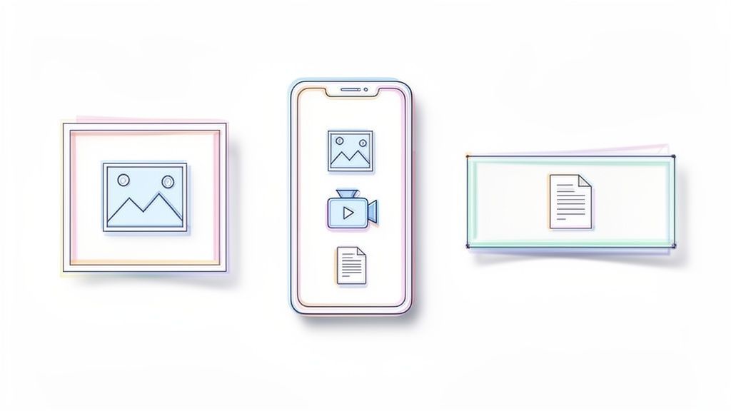
This quick reference is for busy professionals who just need the right numbers, fast. Below are the specs for the most common formats you'll use day-to-day, from standard feed posts to videos and carousels.
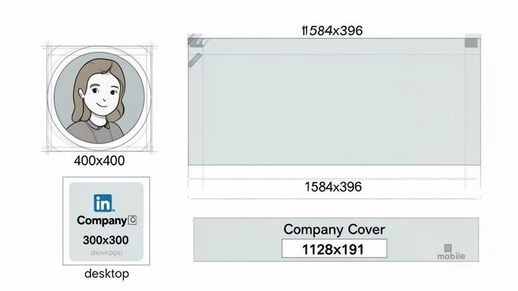
This infographic gives you a quick visual rundown of the key dimensions you'll be using most often.
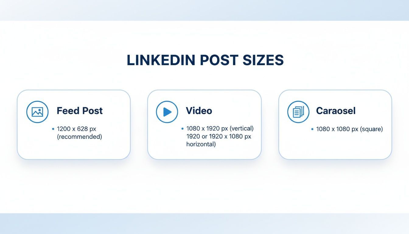
As you can see, each format has its own rules. That’s why tailoring your visuals for each post type is so important.
LinkedIn Image and Video Size Quick Reference
To make things even easier, here's a simple table with the specs for the most common LinkedIn content types. Bookmark this page, or just keep it handy.
You can also dive deeper into the specific dimensions for different LinkedIn post sizes to really perfect your strategy.
| Content Type | Recommended Dimensions (Pixels) | Aspect Ratio | Max File Size |
|---|---|---|---|
| Shared Link Image | 1200 x 627 | 1.91:1 | 5 MB |
| Feed Image (Square) | 1080 x 1080 | 1:1 | 5 MB |
| Feed Image (Vertical) | 1080 x 1350 | 4:5 | 5 MB |
| Video Post | 256 x 144 to 4096 x 2304 | 1:2.4 to 2.4:1 | 5 GB |
| Carousel/Document | 1080 x 1080 or 1080 x 1350 | 1:1 or 4:5 | 100 MB |
Keep these numbers in mind when you're creating content, and you'll always have posts that look clean, professional, and ready to perform.
Mastering Image Sizes for the LinkedIn Feed
When a post shows up in the LinkedIn feed, the size and shape of your image can make or break its performance. It’s not just about avoiding weird crops; choosing the right dimensions is a strategic move that directly impacts engagement. While LinkedIn is pretty flexible, you'll get the best results by focusing on square and vertical formats.
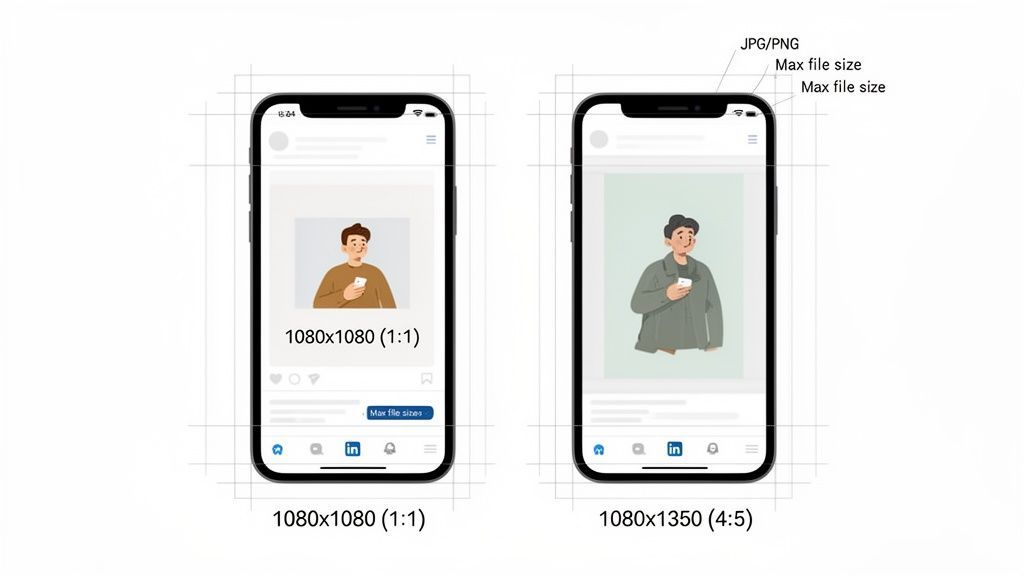
The two formats that dominate single-image posts are square (a 1:1 aspect ratio) and vertical (a 4:5 aspect ratio). Both are solid choices, but they work best in slightly different situations. Knowing when to use each one will give your content an edge.
Choosing Between Square and Vertical Images
Square images are the classic, dependable option. They’re incredibly versatile and look great on both desktop and mobile without any nasty cropping surprises.
- Square Image (1:1): Your go-to dimension here is 1080 x 1080 pixels. This format feels balanced and is easy to work with, making it a safe bet for most visuals, from product shots to team photos.
Vertical images, on the other hand, have a clear advantage on mobile. Because they’re taller, they command more screen real estate, pushing other posts out of view and holding a user’s attention for just a bit longer as they scroll.
- Vertical Image (4:5): The best size is 1080 x 1350 pixels. This format is perfect for storytelling, infographics, or any portrait-style visuals that need that extra height to really shine.
And let's be honest, optimizing for mobile is non-negotiable. With so many people browsing on their phones, you have to design for that experience first. For instance, data shows 72% of Bulgarian users browse LinkedIn on mobile. You can dig into more stats on LinkedIn content performance in Bulgaria to see how regional behavior can shape your strategy.
Essential File and Composition Tips
Getting the dimensions right is only half the battle. A few technical details will ensure your images always look sharp and upload without a hitch.
- Supported File Types: Stick to JPG, PNG, or GIF.
- Maximum File Size: Keep your files under 5 MB. Anything larger might fail to upload or load too slowly for users.
When you're designing, always think about the "safe zone." This is the central part of your image where you need to place all the important stuff, text, logos, or the main subject. This simple habit prevents critical information from getting cut off by the user interface or unexpected crops on different devices. If you want to go deeper, there are some great guides on optimizing images for social media that cover export settings to maintain quality.
LinkedIn Carousel and Document Posts
LinkedIn Carousels, which you might also hear called Document Posts, are one of the most engaging formats on the platform. They let you walk your audience through a detailed story, showcase a portfolio, or break down complex ideas into a series of swipeable slides. But for them to work, getting the dimensions right is the first step to a clean, professional look.
Unlike a standard image post, you upload a carousel as a single document, usually a PDF. Each page of that PDF then becomes a slide in the post. It’s a brilliant way to guide someone through a process, one digestible chunk at a time.
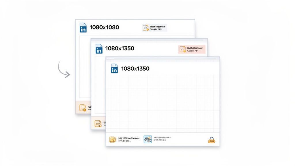
Carousel Slide Dimensions
For a seamless swiping experience, consistency is everything. Every slide in your carousel needs to have the exact same dimensions to avoid any awkward resizing or jarring shifts as people move through it. The best sizes are the same ones we recommend for single image posts, giving you two solid options.
-
Square (1:1): A 1080 x 1080 pixel canvas gives you that classic, balanced look that works perfectly across all devices. It's the safe, reliable choice for almost any type of content.
-
Vertical (4:5): Go with 1080 x 1350 pixels to claim more vertical real estate on mobile feeds. This taller format can feel much more immersive and is great at grabbing and holding your audience's attention.
Pick one format and stick with it for the entire document. This simple discipline is what creates a polished, cohesive narrative that keeps people swiping until the end.
Technical Specs and File Limits
Beyond the creative, there are a few technical rules you need to follow for your document upload to work properly. Keeping these numbers in mind from the start will save you a headache later.
Here’s the breakdown of what LinkedIn allows:
- File Types: You can use PDF, PPT, PPTX, DOC, and DOCX. Honestly, just stick with PDF. It’s the most reliable way to make sure your fonts, images, and layouts look exactly how you designed them.
- File Size: Keep your document under 100 MB.
- Page Count: You can have up to 300 pages (or slides) in a single document.
Pro Tip: Just because you can use 300 slides doesn't mean you should. The sweet spot for engagement is usually somewhere between 5 and 10 slides. That’s enough to tell a good story without fatiguing your audience.
A winning carousel is more than just the right linkedin posts size. Your first slide needs to be a hook, a bold title and compelling visuals that make people stop scrolling and start swiping. And don't forget a clear call to action on the final slide to drive real engagement. If you want to build these more efficiently, you can learn how to schedule LinkedIn carousel posts and get some valuable time back.
Getting Your LinkedIn Video Post Dimensions Right
Video is one of the best ways to stop the scroll on LinkedIn, but if the technical stuff isn't right, your message can fall flat before anyone even watches. A video that's sized or formatted poorly just looks unprofessional. Making sure you stick to the correct specs is the very first step to creating video content that actually works.
The good news is that LinkedIn is pretty flexible. It supports a massive range of aspect ratios, which lets you create anything from cinematic wide-screen content to immersive, mobile-first videos. You can technically use almost any ratio between 1:2.4 (super wide) and 2.4:1 (very tall), but most creators get the best results by sticking to a few standard formats.
Key Video Aspect Ratios
Picking the right aspect ratio isn't just a technical choice; it's a strategic one. It directly impacts how your video shows up in the feed, especially for the huge number of people scrolling on their phones.
These are the most common and effective choices:
- Square (1:1): This is a fantastic all-rounder. It looks clean and balanced on both desktop and mobile, so you don't have to worry about weird cropping.
- Vertical (4:5 or 9:16): These taller formats are built for mobile viewing. They fill up more of the screen as someone scrolls, making your content much harder to ignore. Perfect for immersive storytelling.
Sticking with these tested formats means your video makes the most of the available screen real estate, no matter how your audience is watching.
Technical Specs for LinkedIn Video
Beyond the shape of your video, there are a few other critical numbers you need to know. Getting these right will save you from upload errors and make sure your content plays smoothly for everyone.
First up, length. Your video has to be at least three seconds long, but you can go all the way up to 30 minutes. That said, shorter, punchier videos almost always perform better. The max file size is a pretty generous 5 GB, and the most common file type you'll want to use is MP4.
Here's something people often forget: the thumbnail. A strong, custom thumbnail can massively boost your click-through rate. It's the first thing people see, so make it count with a high-quality image and text that sparks curiosity.
Finally, remember that tons of people watch LinkedIn videos with the sound off. That means burned-in captions aren't just a "nice-to-have" anymore. They are essential for accessibility and engagement. This one small step ensures your message gets across, even in total silence. For a deeper dive, our complete guide to LinkedIn video post sizes has all the details. And with tools like PostFast, you can easily get your videos prepped and scheduled, perfectly optimized every time.
Setting Up Your Professional Profile Visuals
Your LinkedIn profile is your professional storefront, and the visuals are the very first thing people notice. A sharp, correctly sized profile picture and cover photo make an instant good impression. They signal you’re serious and pay attention to detail, like a digital handshake before anyone reads a single word.
Getting these core visuals right is foundational. They don't just live on your profile page; they follow you everywhere, showing up next to every post, comment, and connection request you send. Nailing the quality and consistency here reinforces your brand across the entire platform.
Personal Profile Image Specs
Your personal profile is where you connect with colleagues, recruiters, and clients. The images have to be crisp and clear to build that initial trust and recognition.
-
Profile Picture: The sweet spot is 400 x 400 pixels. LinkedIn crops this into a circle, so make sure your face is centered and you don't have anything important hiding in the corners. A clean, professional headshot is always the right move.
-
Cover Photo (Banner): Go with 1584 x 396 pixels. This wide banner is your personal billboard, a great place to show off your personality, your brand, or what you're an expert in. Just be mindful that it looks a little different on desktop versus mobile, where parts of the edges can get cut off. Keep your key text and visuals closer to the center to be safe.
A well-done cover photo does way more than just fill an empty space. It tells a story about who you are professionally. Think of it that way.
Company Page Image Specs
For a business, the company page visuals need to scream professionalism and brand identity. The dimensions here are totally different from personal profiles because they’re designed for a corporate presence.
-
Company Logo: The standard size is 300 x 300 pixels. This little square logo is a huge deal. It appears next to all of your company’s posts and in search results, making it a critical piece of your branding.
-
Cover Image: The recommended size is 1128 x 191 pixels. It's much, much narrower than a personal banner. This space is perfect for highlighting your company’s mission, a new campaign, or what makes your brand valuable.
Making sure these images are sized perfectly prevents them from looking blurry or getting cropped awkwardly. It’s a small thing that makes your brand look polished and credible. Using a scheduler like PostFast can help you manage and update these visuals right alongside your content, keeping your entire presence sharp and consistent.
Common Sizing Mistakes and How to Avoid Them
Even if you know the right LinkedIn post sizes, a few small mistakes can still wreck your visuals. We’ve all seen them: blurry images, awkwardly cropped logos, or text that’s impossible to read. These little slip-ups can make your brand look unprofessional, but they’re easy to fix once you know what to look for.
One of the biggest culprits is LinkedIn’s own image compression. You upload a massive, high-resolution file thinking it will look sharp, but LinkedIn automatically shrinks it. In the process, your crisp graphic can turn soft and fuzzy, especially if it has fine details or small text.
Overlooking Aspect Ratio and Cropping
Another classic mistake is uploading an image with the wrong aspect ratio. You might have a great wide-angle photo, but if you drop it into a 1:1 square post, LinkedIn will decide how to crop it for you. More often than not, it cuts off the most important part of your image, ruining the whole composition.
This gets even trickier on mobile. An image that looks fine on a wide desktop monitor can get butchered on a vertical phone screen.
To stay out of trouble, just stick to the recommended aspect ratios:
- 1:1 for square posts (1080 x 1080 pixels)
- 4:5 for vertical posts (1080 x 1350 pixels)
- 1.91:1 for shared link images (1200 x 627 pixels)
Quick Tip: Before you export, always check that your main message, logo, or subject is inside a "safe zone" in the center of your design. This is a simple gut check to ensure nothing important gets cut off if the platform’s interface elements cover the edges.
Forgetting About Text Readability
This one is easy to miss. You cram a bunch of text onto an image, and it looks perfectly fine on your big design monitor. But once it hits the feed and someone sees it on their phone, the text becomes a blurry, unreadable mess. Your message is completely lost.
The rule here is to keep text on images big, bold, and brief. Use high-contrast colors so it pops, and stick to just a few key words or a punchy headline. The visual is there to grab attention, not to serve as a detailed document.
A quick checklist before you hit publish can save you a world of pain. Just ask: Is the image sharp? Is the aspect ratio right for the post type? Is every word easy to read? Using a tool like PostFast is a game-changer here, as its preview feature shows you exactly how your post will look in the feed. It lets you spot and fix these common mistakes before anyone else does.
LinkedIn Post Sizes: Your Questions Answered
Getting LinkedIn image sizes just right can feel like a guessing game. Sometimes things look perfect in your design tool but end up blurry or awkwardly cropped in the feed. It happens.
Here are the fixes for the most common headaches people run into. Think of this as your go-to troubleshooting guide.
Why Do My Images Look Blurry on LinkedIn?
If your image looks fuzzy, you can almost always blame LinkedIn’s compression. When you upload a visual that doesn't fit their recommended dimensions, the platform forces it to resize, and that’s when quality drops.
The fix is to give LinkedIn a perfectly sized image from the start. Export your visual at 1080 pixels wide for a standard square post. Using a PNG file often helps, especially for graphics heavy on text or sharp lines, as it tends to hold up better than a JPG. And one golden rule: never, ever scale a small image up to make it bigger. That’s a guaranteed recipe for a pixelated mess. When you upload at the correct size, you minimize compression and keep things looking sharp.
What Is the Best Image Size for Mobile Viewers?
On mobile, a vertical 4:5 aspect ratio (1080 x 1350 pixels) is your best bet. It fills up much more of the screen on a phone, which is a massive advantage for grabbing and holding someone's attention as they scroll.
While a classic 1:1 square image still works great on mobile, that extra vertical space gives you a real edge. Just be sure to keep your key message and visuals away from the very top and bottom. The LinkedIn app's interface can sometimes cover those edges, so creating a "safe zone" in the center ensures nothing important gets cut off.
Can I Edit an Image After Publishing a Post?
Nope. Once a post is live, LinkedIn doesn’t let you swap out an image, video, or document. You can go back and tweak the text, but the visual is locked in.
If you spot an error in your image after hitting publish, the only solution is to delete the entire post and start over with the corrected version. This is exactly why previewing your content is so critical.
A quick final check before you publish saves you the headache of deleting and reposting. It’s a simple step that lets you catch any weird sizing, cropping, or quality problems before your audience does.
This is also where a scheduling tool with a solid preview feature really proves its worth.
Ready to stop worrying about sizes and start creating standout content? With PostFast, you can schedule all your LinkedIn posts with perfect formatting every time. Try it free and see how easy it is to keep your brand looking professional. Get started with PostFast
Related articles

Best AI Tools for Social Media Management in 2026 (Honest Guide)
The best AI tools for social media management in 2026: honest picks for drafting, scheduling and agent-run workflows, plus copy-paste ChatGPT prompts.

10 Ways to Make Money with AI in 2026 (Ranked by Realism)
The ways to make money with AI in 2026 that actually work, ranked by realism: AI-powered services, content systems, products and the traps to skip.

How to Make Money on Social Media in 2026: 8 Models That Actually Pay
How to make money on social media in 2026: the 8 income models, real platform payout thresholds compared, and the consistency math behind creators who earn.
How to Make Money on Instagram in 2026 (Real Numbers, No Hype)
How to make money on Instagram in 2026: the real follower thresholds for gifts and subscriptions, why brand deals pay most, and the math at every audience size.
Best Time to Post on X (Twitter) in 2026: A Practical, Data-Informed Guide
The best time to post on X (Twitter) in 2026: day-by-day windows, when 9,339 real scheduled posts actually publish, and how to find your own peak hours.
How Many Followers on TikTok Do You Need to Get Paid?
How many followers you need to get paid on TikTok in 2026: 0 for some paths, 1,000 for LIVE and Shop, 10,000 for Creator Rewards. Plus the views math.