The Ultimate Facebook Profile Image Size Guide
Master the correct Facebook profile image size for a pixel-perfect look on desktop and mobile. This guide covers dimensions, safe zones, and best practices.

On this page (15)
Getting your Facebook profile image size right is simpler than you think. For the best quality across all devices, start with a square image that's at least 320x320 pixels.
While Facebook shrinks and crops it for different spots, like comments or the news feed, uploading a sharp, high-resolution square file ensures it looks clean everywhere. Think of it as your digital handshake. It’s the first thing people see, so getting this small detail right makes a big difference.
A Quick Guide to Facebook Profile Dimensions
Your profile picture is your visual signature on Facebook. It shows up on your main profile, as a tiny thumbnail next to your posts, and in Messenger. To keep it looking professional, you need to understand how it gets displayed. This reference guide breaks down the essential dimensions.
If you need a full rundown of every image spec on the platform, check out our complete guide to Facebook image sizes.
Why Your Profile Picture Size Actually Matters
Think of your profile picture as the digital handshake for your brand or personal page. It's often the very first thing people see, and a crisp, clear image signals professionalism and attention to detail. It is a small thing that makes a huge difference in how potential followers or clients see you.
Get it wrong, and your picture ends up blurry, pixelated, or awkwardly cropped. That can make you look careless, damaging your credibility before anyone even reads your posts. For a business, that first impression can be the difference between gaining a new customer and losing their trust instantly. Nailing the facebook profile image size is a quick win for a strong start.
Building Trust Through Clarity
The ideal size for a Facebook profile picture is 180x180 pixels on a desktop. It gets resized for mobile and thumbnails, so starting with a sharp, correctly sized image is key. This is especially true in a place like Bulgaria, where Facebook's ad reach hits 52.0% of the population. When one platform has a 93.99% social media share, as DataReportal shows, you absolutely have to look your best to stand out.
This is not just about aesthetics; it’s about building subconscious trust. When your visuals are sharp, people assume the rest of your work is too. For a deeper look at improving your entire online presence, check out our guide on social media optimisation. It's a foundational step that makes all your scheduled content work that much harder.
Getting the Circular Crop Right
Facebook loves its circles. You upload a nice square picture, but on news feeds, comments, and pretty much everywhere else, it shows up in a circular frame. This can be a real pain, as the automatic crop often lops off the corners of your logo or the edges of your photo.
This is why you need to pay attention to the safe zone. Think of it as the central sweet spot in your square image that is guaranteed to be visible after Facebook does its thing. If you want a clean, professional look, you have to place all the important stuff, your face, your logo, your main subject, smack in the middle.
It's just like a bullseye. The most critical part of your image needs to be right in the center to avoid any awkward cropping that makes your brand look sloppy.
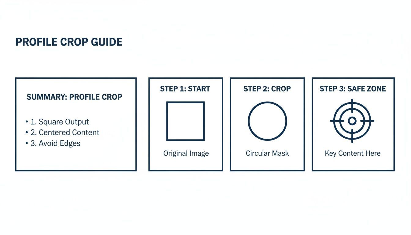
Visualising the Safe Zone
It helps to see exactly what gets cut off so you are not just guessing. It’s always the corners that get lost.
Here’s a simple diagram showing the safe zone inside a standard square profile picture.
As you can see, anything you stick in the corners will disappear completely. By keeping your main subject centered, you ensure it stays perfectly framed every time. This is especially important when you're scheduling content with a tool like PostFast, as a well-composed profile picture ensures your brand looks polished and consistent across every single post you publish.
Optimizing Your Image File for Best Quality
Getting the dimensions right is only half the story. The file format you choose and how you save it can make or break the final result on your profile.
Facebook is notorious for its aggressive image compression. It’s a necessary evil to keep the platform snappy, but it can turn a perfectly sharp photo into a blurry, pixelated mess. Your best defense is to give its algorithm a clean, high-quality file to start with.
Choosing Between JPG and PNG
For profile pictures, you’re almost always choosing between a JPG or a PNG.
- JPG is your go-to for photographs with lots of colors and subtle gradients.
- PNG is the clear winner for logos, text, or any graphic with sharp lines. It keeps those edges crisp.
The choice comes down to understanding the difference between lossy and lossless compression. JPGs use lossy compression, which cleverly discards a tiny bit of data to create a smaller file. PNGs are lossless, meaning they keep every single pixel of detail, which usually means a larger file size.
Here’s a simple visual to show how your square upload becomes the final circular display.
The key takeaway is this: your design has to work as both a square and a circle. Always keep the most important elements dead center.
Regardless of the format, always export your final image at the highest quality setting possible. Aim to keep the file size under 100 KB if you can. A smaller, cleaner file gives Facebook’s compression less work to do, which almost always results in a better-looking picture.
For agencies juggling multiple client accounts, this is where a consistent workflow pays off. Using a scheduler like PostFast to manage your posts lets you establish a standard export process, ensuring every client's profile picture meets these quality benchmarks without a second thought.
How Your Profile Picture Appears on Desktop and Mobile
Your profile picture is not a static, one-size-fits-all element. It changes position and prominence depending on whether someone’s viewing your page on a desktop or a mobile phone. Getting this right is the key to a professional look that works everywhere. If you don't plan for it, your image can get awkwardly cropped or clash with your cover photo, instantly undermining your brand.
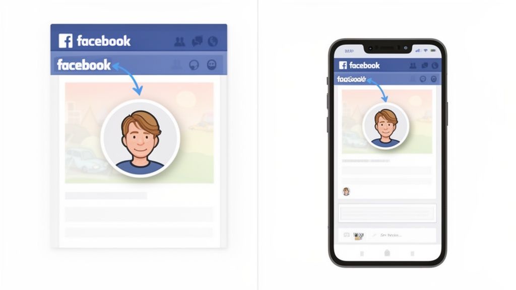
On a desktop, things are pretty straightforward. Your profile picture sits to the left of your cover photo, overlapping it just a tiny bit at the bottom. This layout gives both images plenty of room to breathe and do their job.
But on mobile, the layout flips completely, and this is where most people get tripped up.
Mobile View Changes Everything
On a phone, your profile picture moves to the center and sits much more aggressively over your cover photo. This shift can easily block important text, logos, or other key details in your cover image if you have not anticipated it. The way these two elements interact is what separates a polished profile from an amateurish one.
For businesses in Bulgaria, getting these details right is non-negotiable. It’s best to upload your profile image at 180x180 pixels. On mobile, this image is positioned with a 196px top offset, dropping it right over the cover photo. Mastering this layout is vital in a market where Facebook commands over 90% of social media usage, as you can see from the latest insights on the Bulgarian digital landscape on DataReportal.
The key takeaway here is simple: you cannot design your profile picture and cover photo in isolation. They are a team, and their relationship changes dramatically from desktop to mobile.
To keep your branding tight and consistent, you need a clear strategy for both. You can nail the other half of this visual puzzle by checking out our guide to Facebook cover photo dimensions. When you schedule content with a tool like PostFast, having a perfectly harmonized profile ensures every post is framed by a professional identity, no matter how your audience finds you.
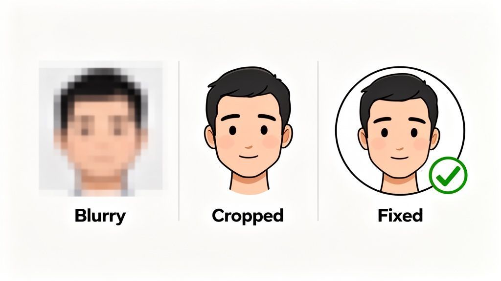
Solving Common Profile Picture Problems
Even when you follow all the rules for the correct facebook profile image size, things can still go sideways. You upload a perfectly sharp image from your computer, and suddenly it looks blurry or pixelated on your profile. This is usually down to Facebook's aggressive compression, which is designed to keep the platform running fast.
Don't worry, these issues are frustrating but almost always fixable. With a few simple adjustments, you can get ahead of these common headaches and get your profile looking sharp.
How to Fix Blurriness and Pixelation
The number one culprit behind a blurry profile picture is an image that’s too small. Facebook’s minimum is 180x180 pixels, but its compression algorithm can be really harsh on smaller files. The best way to fight back is to give it more data to chew on.
Here are a few quick fixes to try:
- Upload a Higher Resolution Image: Instead of the minimum, go for a larger square image like 720x720 pixels or even 1080x1080 pixels. This gives Facebook’s compression more detail to work with, which means a much sharper final image.
- Check Your File Type: For photos, a high-quality JPG is usually fine. But for logos or graphics with sharp lines, always use a PNG to keep those edges crisp.
- Avoid Repeatedly Saving a JPG: Every time you save a JPG, it loses a little bit of quality. Always edit from your original source file and save it just once before you upload.
The counterintuitive trick is to go bigger. A larger, high-quality source file is your best defense against Facebook's compression, ensuring your profile picture stays sharp and clear.
By starting with a larger, cleaner file, you’re setting yourself up for success. This is especially useful for businesses and agencies using a scheduler like PostFast, as it ensures brand visuals remain consistent and high-quality across all scheduled posts without needing constant tweaks.
Common Questions, Answered
Got a couple of lingering questions about your Facebook profile image size? You're not the only one. Here are the quick answers to the things we get asked most often.
What’s the Best Image Size to Upload?
Facebook asks for a minimum of 180x180 pixels, but you should always aim higher. For a crisp, clean look, upload a square image that’s at least 720x720 pixels. If you can, go for 1080x1080 pixels.
Giving Facebook a larger, high-resolution file means its compression has more data to work with. The result? A much sharper final picture that avoids that dreaded blocky, pixelated look.
Can I Use a Rectangle for My Profile Picture?
You can, but Facebook will make you crop it into a square anyway. This often means something important gets awkwardly chopped off the top, bottom, or sides.
To keep full control and make sure the image looks exactly how you want it, always start with a perfect square. It saves you the headache of unexpected cropping.
Why Does My Profile Picture Look Different on Mobile?
It's all about the relationship with your cover photo. On mobile, your profile picture sits more towards the center and covers a bigger chunk of your cover image than it does on a desktop.
Because of this overlap, it's a smart move to design your profile picture and cover photo as a team. Check them on both mobile and desktop to make sure they look great together, no matter where people see them.
Juggling image sizes for every social platform is a genuine chore. With PostFast, you can schedule everything in one spot, and our tools automatically optimize your visuals for you. It saves a ton of time and keeps your brand looking sharp everywhere. Why not give it a try for free?
Related articles

How to Automate Social Media Posts: The Practical Guide
Learn how to automate social media posts the right way: what to automate, what to keep human, a step by step afternoon setup, and where AI helps or hurts.

How to Automate Social Media Posting with n8n (Free Templates + Verified Node)
Automate social media posting with n8n: install the verified PostFast node, start from free templates, upload media, schedule carousels, and add approval.

Best AI Tools for Social Media Management in 2026 (Honest Guide)
The best AI tools for social media management in 2026: honest picks for drafting, scheduling and agent-run workflows, plus copy-paste ChatGPT prompts.

10 Ways to Make Money with AI in 2026 (Ranked by Realism)
The ways to make money with AI in 2026 that actually work, ranked by realism: AI-powered services, content systems, products and the traps to skip.

How to Make Money on Social Media in 2026: 8 Models That Actually Pay
How to make money on social media in 2026: the 8 income models, real platform payout thresholds compared, and the consistency math behind creators who earn.

How to Make Money on Instagram in 2026 (Real Numbers, No Hype)
How to make money on Instagram in 2026: the real follower thresholds for gifts and subscriptions, why brand deals pay most, and the math at every audience size.