Banner Size Facebook: A Guide to Perfect Facebook Banner Dimensions
Learn the banner size facebook guidelines, recommended dimensions, and tips to optimize your Facebook visuals and ads. Click to boost engagement.
On this page (7)
Getting the right Facebook banner size can be tricky. A personal profile cover is one size, a business page is another, and groups and events follow their own rules.
The real challenge is how images get cropped on mobile versus desktop. A banner that looks perfect on your computer can suddenly have its most important parts cut off on a phone.
A Quick Reference for Banner Sizes
Navigating Facebook's different image specs can be a pain. You spend time creating a banner, only to see it look broken and unprofessional on a smartphone, cutting off your headline or logo. This happens because every placement, from a personal profile to a business page, has its own dimensions and, more importantly, its own "safe zones."
This guide is your cheat sheet for getting it right every time.
Here’s a quick summary of the most common Facebook banner and cover photo dimensions to get you started.
Facebook Banner and Cover Photo Dimensions Quick Reference
| Placement Type | Recommended Dimensions (Pixels) | Aspect Ratio | Key Considerations |
|---|---|---|---|
| Page Cover Photo | 851 × 315 px | 2.7:1 | Displays as 640 × 360 px on mobile. Keep critical elements in the central "safe zone" to avoid cropping. |
| Profile Cover Photo | 851 × 315 px | 2.7:1 | Similar to pages, but your profile picture overlaps on the bottom left (desktop) or centre (mobile). |
| Group Cover Photo | 1640 × 856 px | 1.91:1 | This size adapts better to different screen sizes, but some cropping still occurs at the top and bottom. |
| Event Cover Photo | 1920 × 1005 px | 1.91:1 | A wider format. Facebook automatically adjusts it for news feeds and different displays. |
This table gives you the essentials, but each placement has its own quirks. We’ll break down the exact dimensions for Pages, Groups, and Events, showing you how to handle mobile vs. desktop cropping to avoid any nasty surprises.
It's also helpful to see how these specs compare to other platforms, like the standards for LinkedIn post image sizes. For a complete breakdown of every Facebook-specific dimension, check out our comprehensive guide to Facebook image sizes.
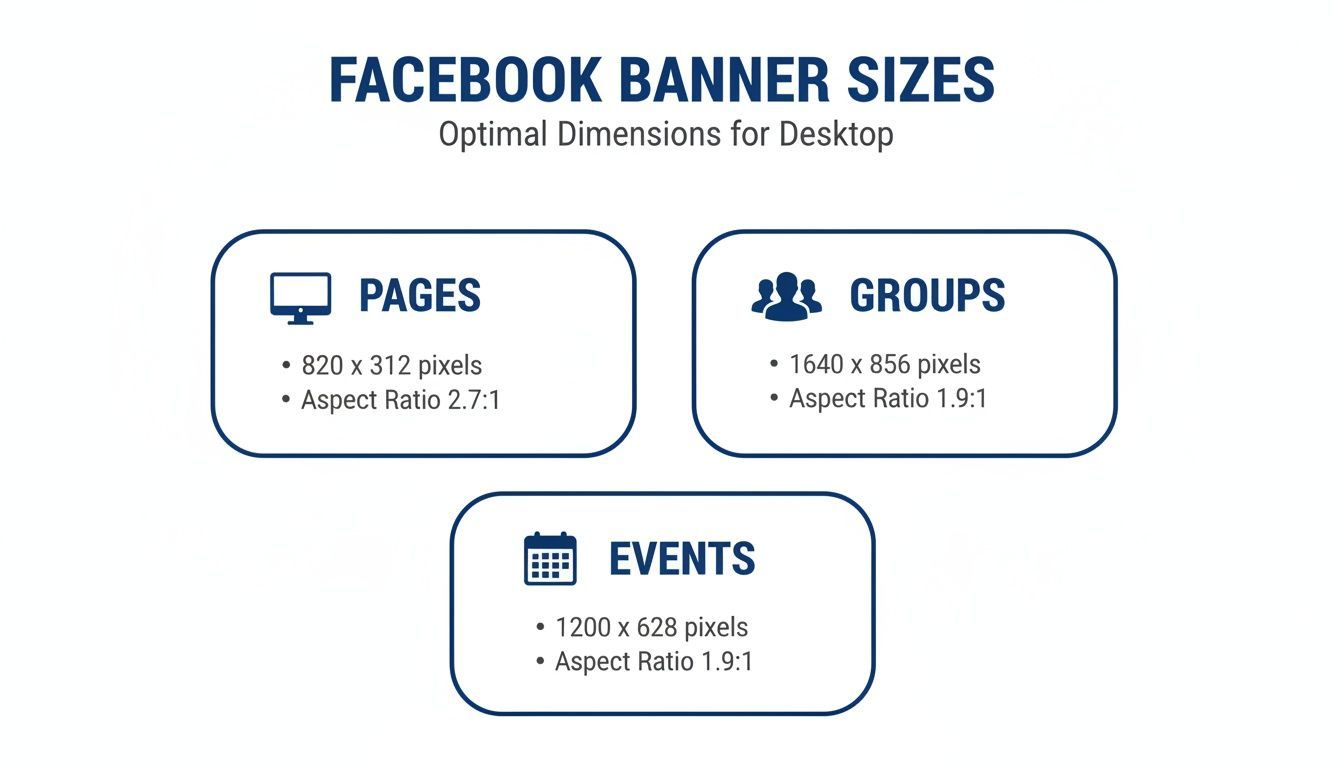
Mastering Your Facebook Page Cover Photo
Think of your Facebook Page cover photo as the digital billboard for your brand. It’s one of the first things a visitor sees, so getting the dimensions right is vital for making a strong, professional first impression. The official recommended size is 851 pixels wide by 315 pixels tall.
Following these dimensions is a great start because it helps your image look sharp, just as you intended. But the real trick is understanding how that single image adapts across different devices.
Understanding Display Sizes and Safe Zones
You upload your cover photo at 851 x 315 pixels, but Facebook doesn't display it that way everywhere. On desktop, it shows up as 820 x 312 pixels. On smartphones, it crops to a more vertical 640 x 360 pixels.
What does that mean for your design? The sides of your image get chopped off on mobile, while the top and bottom get a slight trim on desktop. This can be a problem if your logo, headline, or call-to-action ends up cut off.
The solution is to design within a central "safe zone"—the part of your banner that stays visible no matter the device. Always put your most important elements right in the middle to make sure they're never hidden. For a much deeper dive on this, our guide on the ideal Facebook cover photo size has detailed templates and examples to walk you through it.
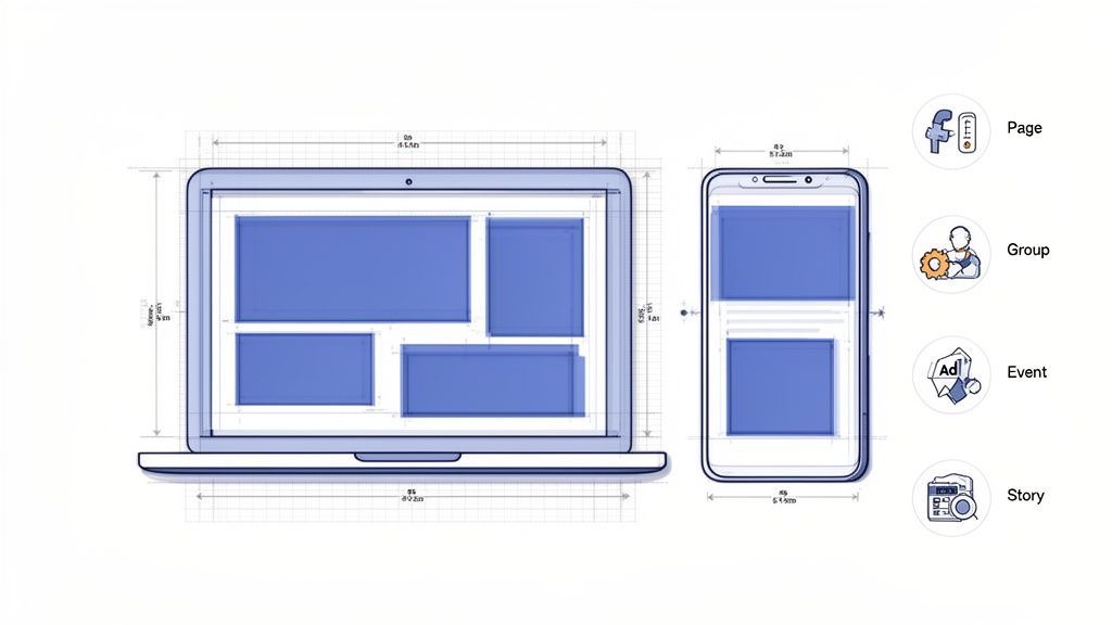
The infographic below breaks down the key dimensions for Pages, Groups, and Events to help you see the differences at a glance.
As you can see, Page banners are wide, but Group and Event banners are taller, which means you can't just reuse the same design without some adjustments.
Why Perfect Sizing Matters in a Growing Market
Getting your banner size right is especially important in active markets like Bulgaria. By late 2025, Facebook had 3.60 million users in the country, a huge number that highlights the platform's solid local presence.
Even more telling is that 98.3% of these users access Facebook on their phones. That makes a mobile-first design strategy a must. A perfectly sized banner ensures your message actually connects with this massive mobile audience, which can give your engagement a serious boost. You can find more details on these trends in DataReportal’s latest report on Bulgaria.
Pro Tip: Your cover photo and your page's call-to-action button should work together. Use visual cues in your banner, like an arrow or a person's gaze, to draw the eye down to that "Shop Now" or "Sign Up" button.
For brands and agencies juggling multiple clients, making sure every banner is pixel-perfect can be a real time-sink. Using a tool with a visual calendar, like PostFast, lets you preview how your cover photo will look alongside your scheduled posts. It's an easy way to ensure a cohesive, professional look across all the pages you manage.
Getting Group and Event Banners Right
When you move from your main Page to Facebook Groups or Events, the banner rules change. These spaces are all about community and promotion, so the visuals need to set the right tone immediately.
The official size for both Group and Event cover photos is 1640 pixels wide by 856 pixels tall. That gives you an aspect ratio of roughly 1.91:1. It's a taller canvas than a standard Page cover, offering more room to show off event details or a community’s personality.
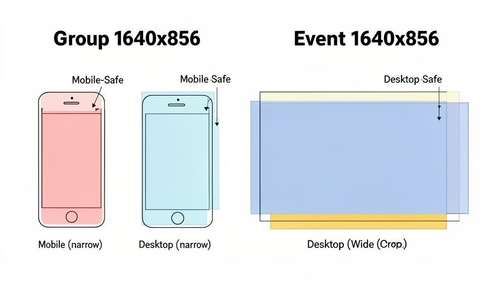
But, just like with your Page cover, what you upload isn’t what everyone sees. The image gets cropped differently depending on the device, which makes understanding the “safe zones” absolutely critical.
Group and Event Banner Safe Zones
For a 1640 x 856 pixel banner, the view changes quite a bit. On a desktop, Facebook shaves a little off the top and bottom. On mobile, the sides get cropped much more aggressively, leaving a taller, narrower image.
This cropping can easily chop off important info like event dates, times, or your group’s mission statement. The fix is to keep all your key text and graphics packed into a central safe zone. Think of it as a hidden frame where all the important stuff lives.
Here’s a quick breakdown to keep your design safe:
- Full Canvas Size: Design at 1640 x 856 pixels.
- Desktop View: Shows the full width, but the top and bottom 96 pixels can get cut off.
- Mobile View: The banner is squeezed to about 920 pixels wide. Your essential elements must fit inside this central column.
By placing your logo, text, and key visuals in the middle of that 1640-pixel canvas, you guarantee they'll look sharp whether someone's on their phone or their computer.
Key Takeaway: Always design your Group and Event banners with a mobile-first mindset. Most people will see it on their phones, so that central vertical slice is your most valuable real estate.
If you’re a community manager or an agency juggling multiple groups and events, these specs can be a headache. Using a scheduling tool like PostFast helps you visualise everything on a calendar. This makes it easier to plan and create properly sized banners for all your activities, ensuring you always look professional.
Decoding Facebook Ad Banner Dimensions
Running successful Facebook ads means playing by a completely different set of visual rules. Unlike your organic posts, where one size can often work, ad banners need to be sized perfectly for each placement. An ad that looks sharp in the main Feed can end up awkwardly cropped in Stories, wasting your budget and hurting your campaign's performance.
The key is to create visuals that feel native wherever they appear. People interact with their Feed differently than they do with immersive, full-screen Stories or quick-scrolling Reels. Matching the banner size Facebook expects for each spot helps your ad blend in naturally, which is a huge factor in boosting engagement and conversions.
Feed Ads: The Versatile Square
The Facebook Feed is still the platform’s prime real estate, and for that, the 1:1 aspect ratio is king. For any single image ad, 1080 x 1080 pixels is the standard. This square format grabs a generous amount of screen space on mobile without being too intrusive.
This size is incredibly flexible because it just works. It’s perfect for everything from showcasing a single product to announcing a flash sale. The balanced canvas gives you enough room for your image and ad copy, making sure your message is clear and easy to grasp as people scroll.
Stories and Reels: Immersive Vertical Banners
When you’re designing for placements like Facebook Stories and Reels, you have to think vertically. These formats are built for a full-screen mobile experience, making the 9:16 aspect ratio non-negotiable. The recommended size here is 1080 x 1920 pixels.
Using a vertical banner here is a must. It fills the entire screen, creating a totally immersive experience that captures someone’s full attention without any distracting black bars. This format is perfect for video ads or dynamic visuals that tell a quick, engaging story. Anything less than full-screen creative looks sloppy and immediately screams "ad," causing users to tap away in a heartbeat.
Crucial Tip: When designing for the 9:16 format, always keep your vital information, like text, logos, and calls-to-action, within the "safe zone." This stops them from being covered by interface elements like the profile icon or the "swipe up" prompt.
Getting these dimensions right is just the first step, but a full campaign involves a bit more know-how. For a deeper dive into setting up your ad campaigns and managing your creative assets effectively, a solid Facebook Ads Manager Tutorial can be an invaluable guide.
For anyone managing multiple campaigns, creating unique assets for every single placement can become a major time sink. This is where tools like PostFast come in handy. By using a central dashboard to plan your ad visuals, you can ensure every banner is perfectly sized and preview how it will look across different placements before you spend a single penny.
Facebook Ad Placement Dimensions and Ratios
To make things even clearer, here’s a quick reference table for the most common Facebook ad placements. Getting these right ensures your ads look professional and perform their best.
| Ad Placement | Recommended Resolution (Pixels) | Supported Aspect Ratio | Best Use Case |
|---|---|---|---|
| Facebook Feed | 1080 x 1080 | 1:1 | Single image or video ads, carousels, collection ads. Great for general brand awareness and product showcases. |
| Stories & Reels | 1080 x 1920 | 9:16 | Immersive, full-screen video or image ads. Ideal for engaging narratives and interactive content. |
| In-Stream Video | 1920 x 1080 | 16:9 | Short video ads that play before, during, or after video content. Best for capturing attention quickly. |
| Marketplace | 1080 x 1080 | 1:1 | Product-focused ads targeting users with high purchase intent. Works well for e-commerce and local sales. |
| Right Column | 1080 x 1080 | 1:1 (renders at 16:9) | Desktop-only ads. Good for retargeting campaigns and driving traffic to a website or landing page. |
| Search Results | 1080 x 1080 | 1:1 | Ads that appear in Facebook search results. Effective for capturing users actively looking for products or services. |
This table should serve as your go-to cheat sheet. By tailoring your creative to each specific placement, you avoid the common pitfalls of weird cropping and low engagement, giving your campaigns the best possible chance to succeed.
Essential Technical Tips for Flawless Banners
Getting the banner size right is step one, but the technical details are what make your brand look truly professional. File format, resolution, and compression all play a huge role in whether your banner shows up sharp and vibrant or blurry and pixelated.
The two formats you’ll use most are JPG and PNG. Think of JPGs as your go-to for photographs and complex images with lots of colours. They hit that sweet spot between quality and file size, which helps your banner load quickly for everyone.
PNG, on the other hand, is the clear winner for graphics that feature logos, text, or sharp lines. Because PNG files support transparency and don’t lose quality from compression, your branding elements will always look crisp.
File Formats and Compression Explained
Choosing the right format is key because of how Facebook handles images. When you upload a banner, Facebook automatically compresses it to save space and speed up loading times. That compression can sometimes sabotage your image quality.
Key Insight: If you can keep your banner under 100 KB, Facebook's compression is much gentler. Exporting a high-quality JPG or PNG and aiming for this file size is a great trick to maintain visual clarity.
Here’s a simple breakdown to guide your choice:
- Use JPG for: Complex photographs, images with gradients, and when a smaller file size is the top priority.
- Use PNG for: Banners heavy with text, logos, or solid blocks of colour where you need maximum sharpness.
This same logic applies to the other visuals on your profile. For instance, knowing the optimal Facebook profile image size and format can stop a blurry first impression before it happens.
Resolution and Export Settings
Finally, let's talk resolution. Always build your designs at the recommended pixel dimensions, like 851 x 315 pixels for a Page cover.
When you’re ready to save, look for an "Export for Web" option in your design software. This setting is perfect because it strips out unnecessary data, shrinking the file size without a noticeable drop in quality. A standard resolution of 72 DPI (dots per inch) is all you need for web display. Master these simple technical settings, and every banner you upload will look flawless.
Common Banner Mistakes and How to Avoid Them
Even with the perfect banner size, a few simple mistakes can completely undermine your efforts. Getting the dimensions right is a great start, but creating a truly effective banner means dodging the common blunders that make your brand look unprofessional.
One of the most frequent slip-ups is putting important info too close to the edges. Any text, logos, or calls-to-action hugging the border are just asking to be chopped off on different devices. Always respect the safe zones we've covered to make sure your key message actually gets seen everywhere.
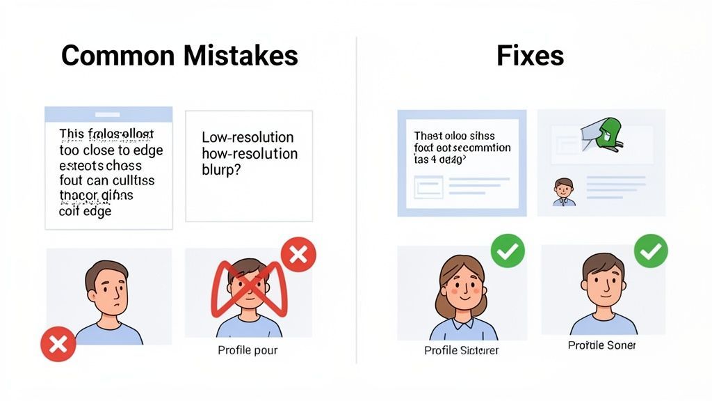
Another classic mistake is using low-resolution images. Nothing screams "amateur" faster than a pixelated or blurry banner. It instantly cheapens your brand's look. Start with a high-quality image and export it with the right settings to keep it looking crisp, even after Facebook works its compression magic.
Strategic Design Oversights
Technical errors aside, plenty of banners just miss the mark on design. A big one is creating a banner that clashes with the profile picture. On most layouts, your profile pic will overlap a chunk of the banner, so your design absolutely must account for that.
Important Note: A busy or cluttered design just overwhelms people. Too many colours, fonts, or competing elements make your banner a confusing mess. Stick to a clean, focused design that points everyone toward a single, clear message.
To keep your designs on point, remember these three things:
- Design Harmony: Make sure your banner’s colours and style play nicely with your profile picture instead of fighting with it. They should feel like they belong together.
- Text Overload: Don't try to cram an entire paragraph into your banner. A short, punchy headline is way more powerful.
- Ignoring Policies: Get familiar with Facebook's content policies. Misleading claims or forbidden content can get your image pulled or, worse, your page penalised.
By sidestepping these common blunders, you'll end up with banners that are not just technically correct but also strategically sound. It'll save you a ton of frustrating and time-consuming revisions down the road.
Your Final Facebook Banner Checklist
Before you publish anything, it’s worth running through a quick final check. A few seconds here can save you the headache of seeing your new banner cropped in weird ways or looking soft and blurry.
Think of it as your pre-flight check. It’s the last step to make sure all the hard work you put into the design actually pays off once it's live.
The Pre-Flight Check
Use this quick list to make sure your banner is good to go. It covers the technical details and the bigger picture, so you know you haven’t missed anything.
-
Correct Dimensions and Ratio? Double-check you've used the right pixel dimensions for the banner’s placement, like 1640 x 856 px for a Group cover. This is the number one reason banners get cropped unexpectedly.
-
Safe Zones Respected? Is your text, logo, or call-to-action sitting comfortably inside the central safe zone? This is a must for making sure it looks right on mobile.
-
Optimal File Format? Did you export as a JPG for a photo or a PNG for a design with crisp text and logos? The right choice makes a huge difference in how sharp your banner looks.
-
File Size Under 100 KB? Keeping your file small is the best way to avoid Facebook’s aggressive compression, which can make your image look fuzzy.
-
Does It Support Your Goal? Does the banner’s message line up with what you’re trying to do right now? Whether that’s getting clicks, promoting an event, or just building brand recognition, the banner should be working for you.
A great way to streamline this is to see your banner in context before it goes live. For instance, the calendar inside PostFast lets you preview how a new banner will look next to your other scheduled posts, so you can make sure everything feels cohesive.
Frequently Asked Questions About Facebook Banners
Getting your Facebook banner just right can be tricky. It's common to run into issues with blurriness or how things look on a phone. Here are the answers to the most common questions we see, so you can get your visuals looking sharp every time.
Why Does My Facebook Cover Photo Look Blurry?
If your cover photo is blurry, it's almost always one of two culprits: aggressive file compression by Facebook or the wrong file format. When you upload a big image, Facebook shrinks it down to save space, and that process can make it look soft or pixelated.
The fix is simple. Export your banner as a JPG or PNG file that's less than 100 KB. For anything with text or a logo, a PNG is usually your best bet because it keeps those sharp lines crisp, which a JPG can sometimes smudge.
What Is the Best Banner Size for Mobile Users?
Honestly, the best banner for mobile is one you design for mobile from the very beginning. You might upload your Page cover at 851 x 315 pixels, but on a phone, it gets cropped and displayed at 640 x 360 pixels. The sides get completely chopped off.
Because of this, you have to place your most important stuff, like your logo, headline, or call-to-action, smack in the centre. Think of it as a "safe zone." Keeping everything there guarantees your message gets across to the huge majority of people who will see it on their phones.
Can I Use the Same Banner for My Page and Group?
It’s tempting, but it’s not a good idea. A Page cover (851 x 315 pixels) and a Group cover (1640 x 856 pixels) are completely different shapes and sizes. If you try to use the same image for both, you’ll end up with some seriously awkward cropping that cuts off key parts of your design.
For a professional look, take the extra minute to create a separate banner for each. It’s a small step that makes a huge difference in how people see your brand, whether they’re landing on your page for the first time or joining your community.
Creating unique, perfectly sized banners for every single placement can feel like a chore. With PostFast, you can use the visual calendar to plan and preview all your creative assets in one place, making sure you have a polished and cohesive look everywhere. Start your free trial at PostFast and see how easy it is.
Related articles

How to Automate Social Media Posts: The Practical Guide
Learn how to automate social media posts the right way: what to automate, what to keep human, a step by step afternoon setup, and where AI helps or hurts.

How to Automate Social Media Posting with n8n (Free Templates + Verified Node)
Automate social media posting with n8n: install the verified PostFast node, start from free templates, upload media, schedule carousels, and add approval.

Best AI Tools for Social Media Management in 2026 (Honest Guide)
The best AI tools for social media management in 2026: honest picks for drafting, scheduling and agent-run workflows, plus copy-paste ChatGPT prompts.

10 Ways to Make Money with AI in 2026 (Ranked by Realism)
The ways to make money with AI in 2026 that actually work, ranked by realism: AI-powered services, content systems, products and the traps to skip.

How to Make Money on Social Media in 2026: 8 Models That Actually Pay
How to make money on social media in 2026: the 8 income models, real platform payout thresholds compared, and the consistency math behind creators who earn.
How to Make Money on Instagram in 2026 (Real Numbers, No Hype)
How to make money on Instagram in 2026: the real follower thresholds for gifts and subscriptions, why brand deals pay most, and the math at every audience size.